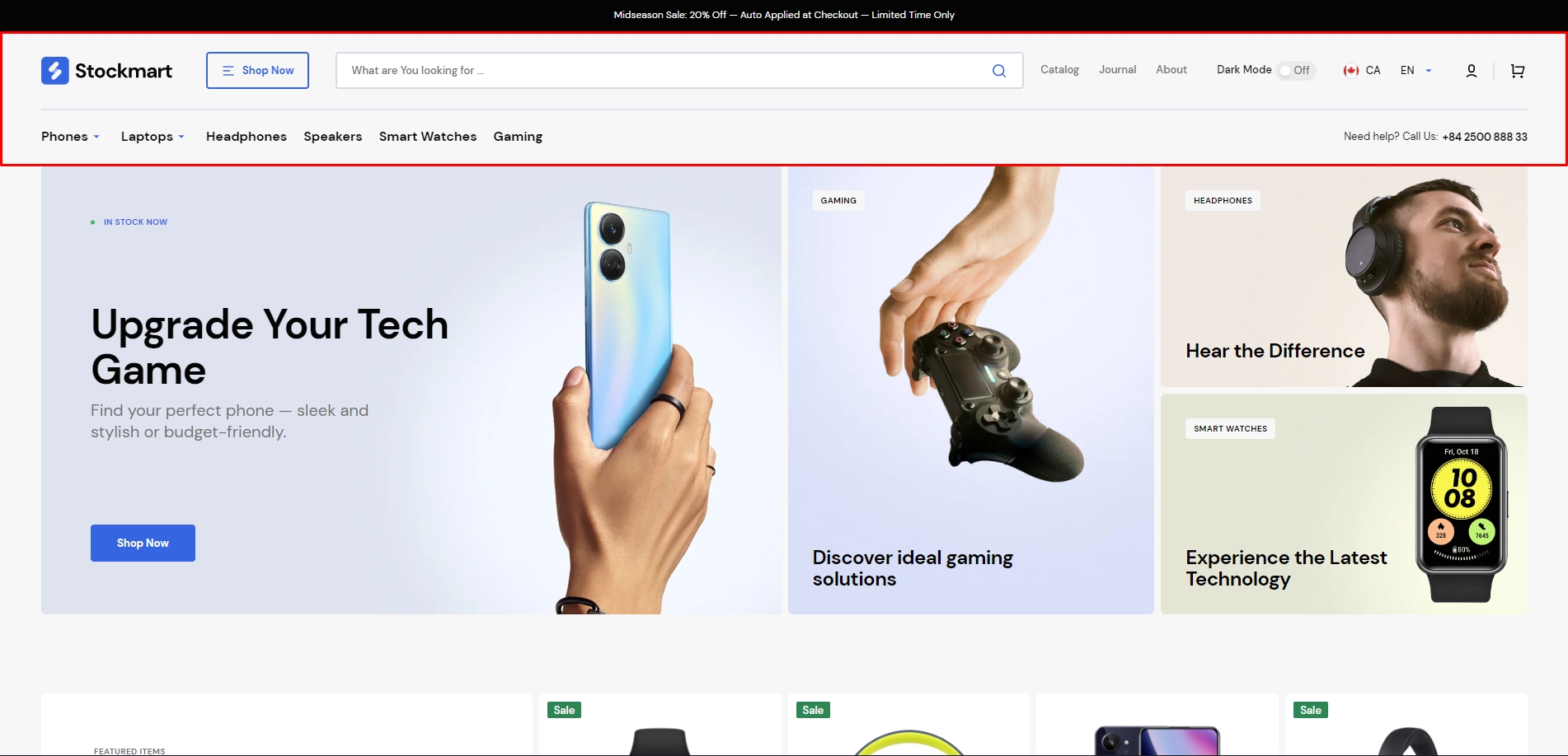
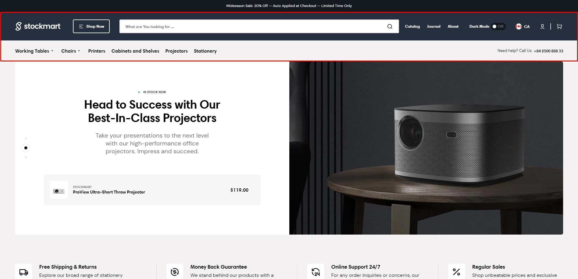
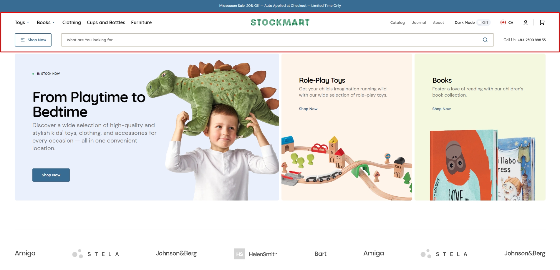
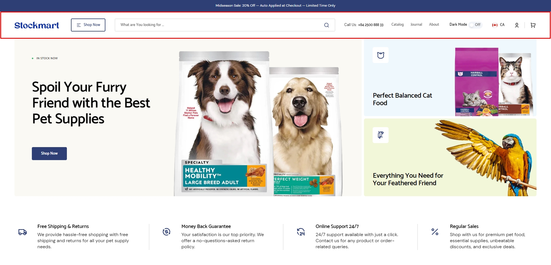
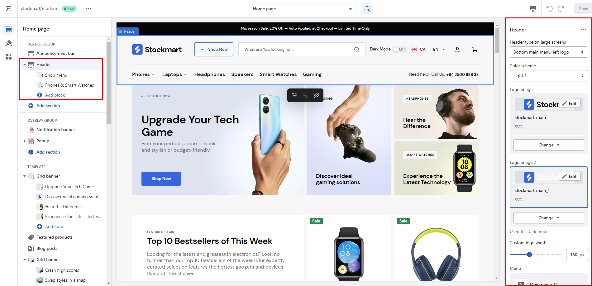
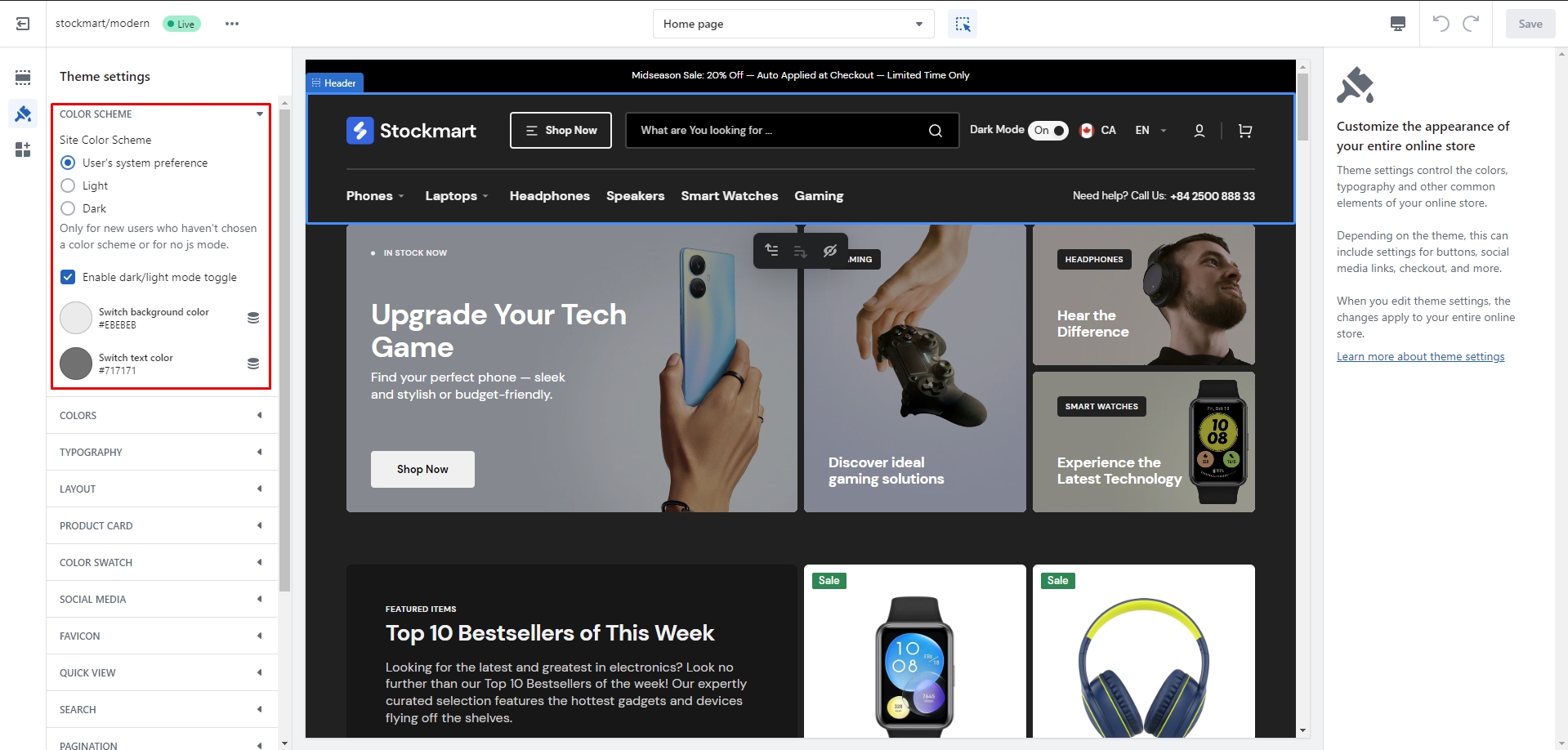
There are several types of the header in this theme. You can choose a layout and a color scheme.
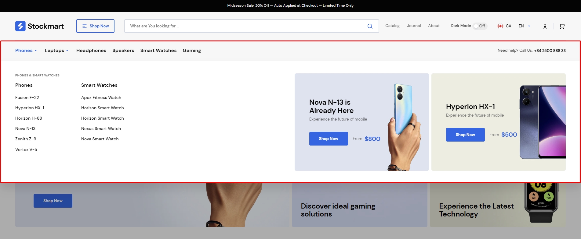
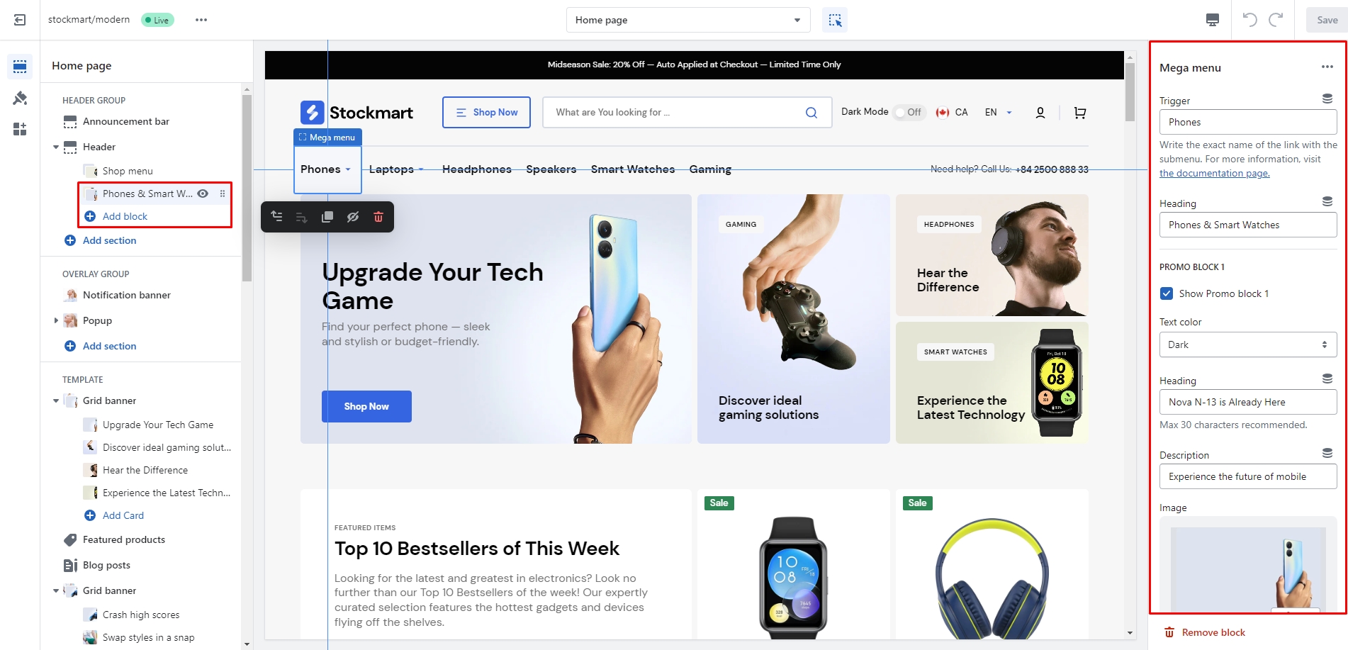
Mega Menu
To add a Mega menu, make sure that the main menu link has sublinks, and then follow these steps:
Add the Mega menu to the Header.
Type the exact name of the link in the Trigger field.
Additionally, you can add images, text, and links to the two promo blocks, and choose their color scheme.
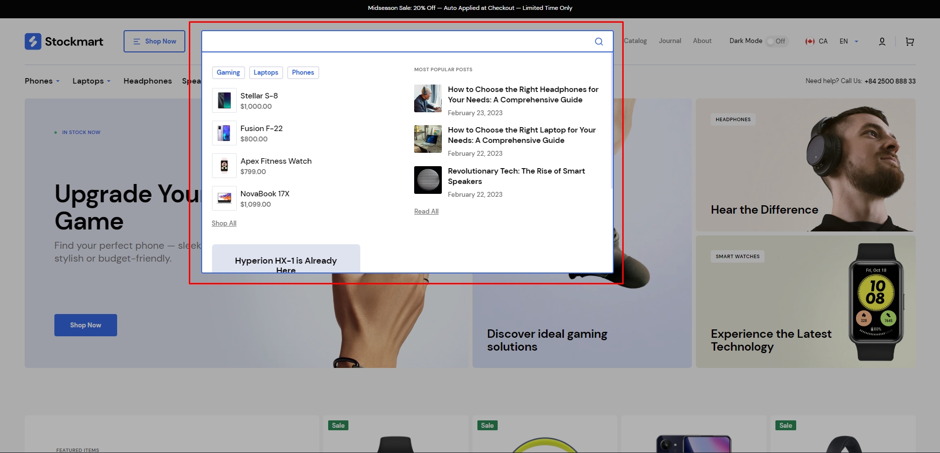
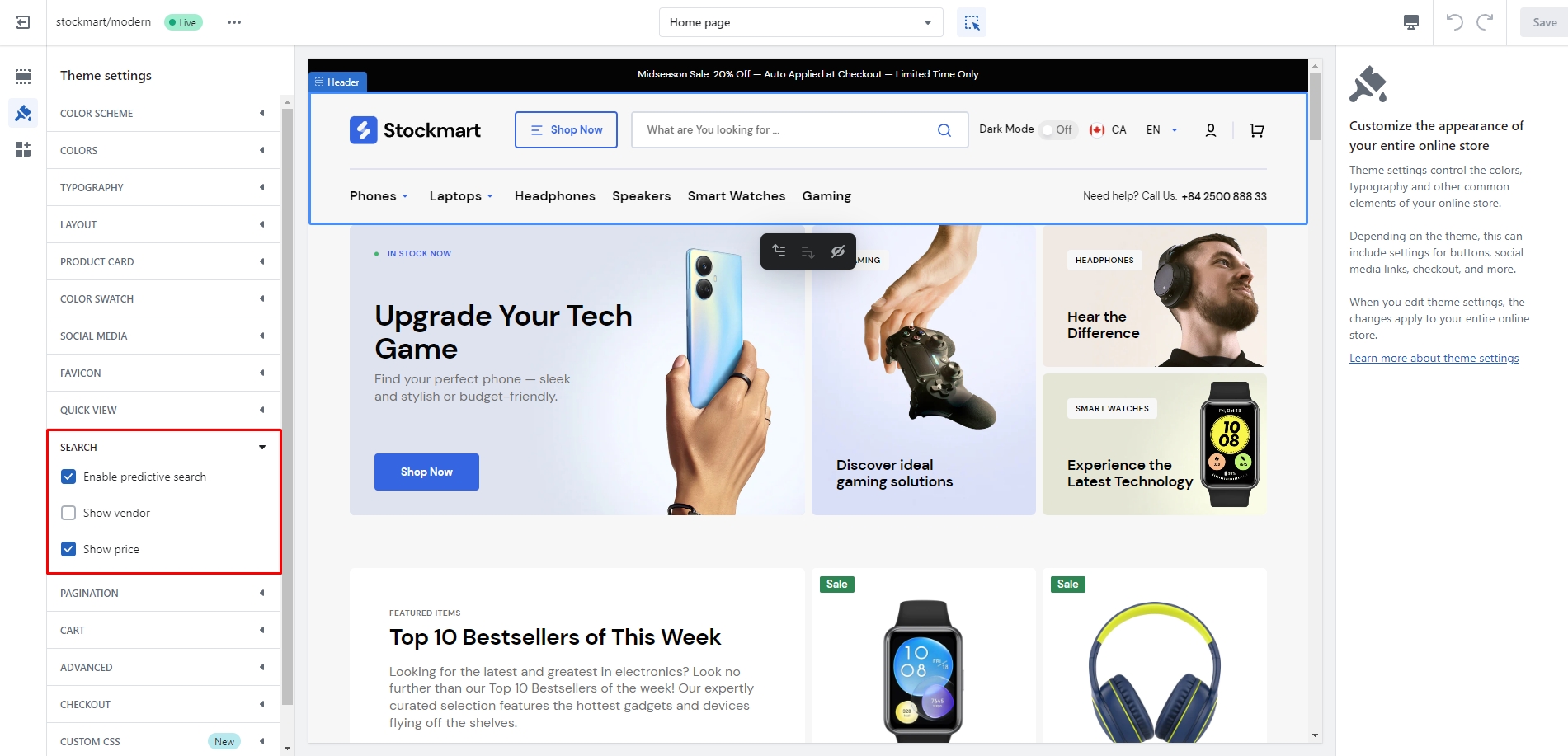
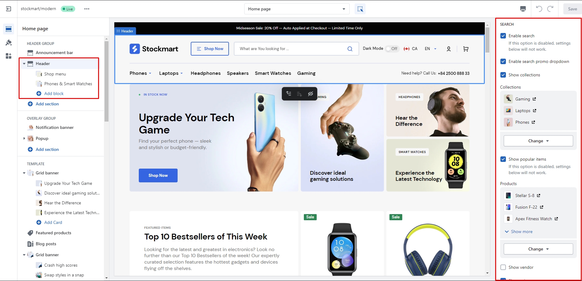
Search
In this theme, you can use a predictive search. It is enabled by default, but you can disable it in the
Theme settings >
Search.
You can also enable the Search promo dropdown in the Header settings, which opens before the user starts to
type. There
are 4 types of information that can be added to this dropdown: collections, products, blog posts, and one
promo block.
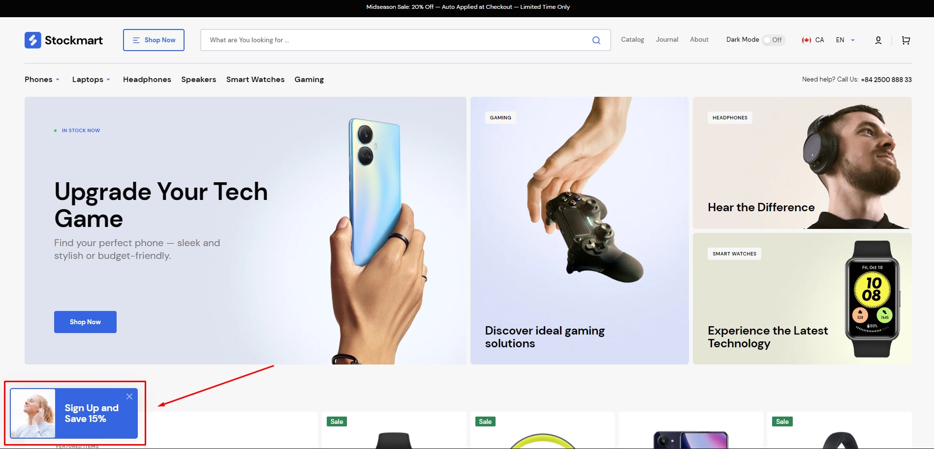
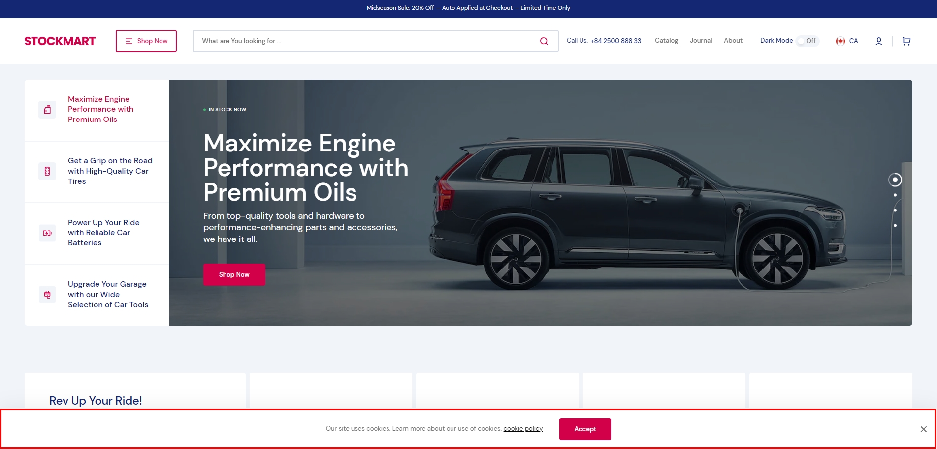
Overlay Group
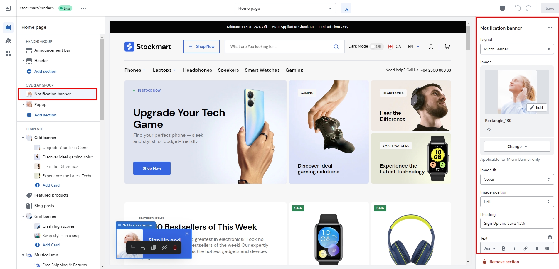
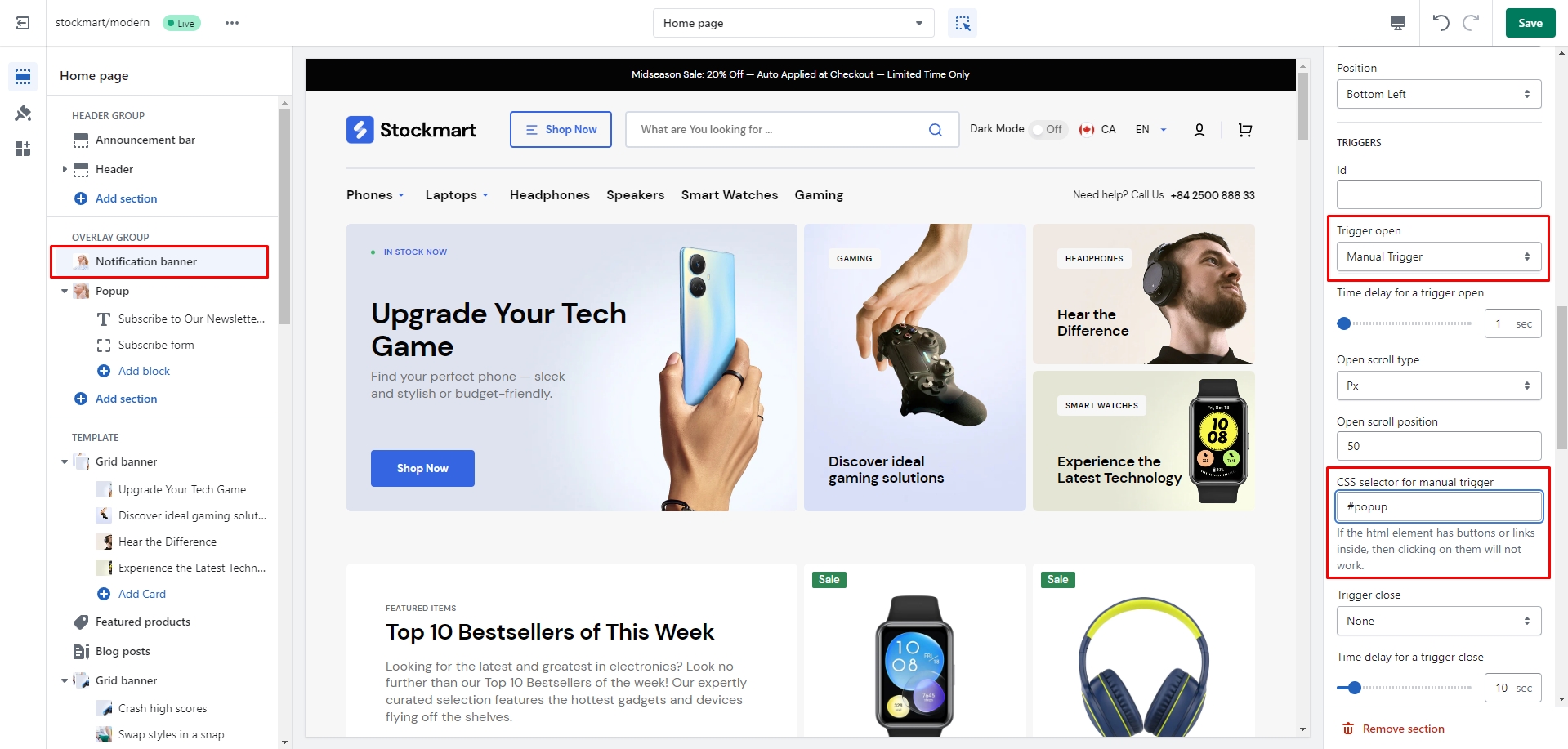
Notification Banner
In the Notification Banner settings, you can change layout, add image, texts, edit banner position, change
open and exit
animations and options.
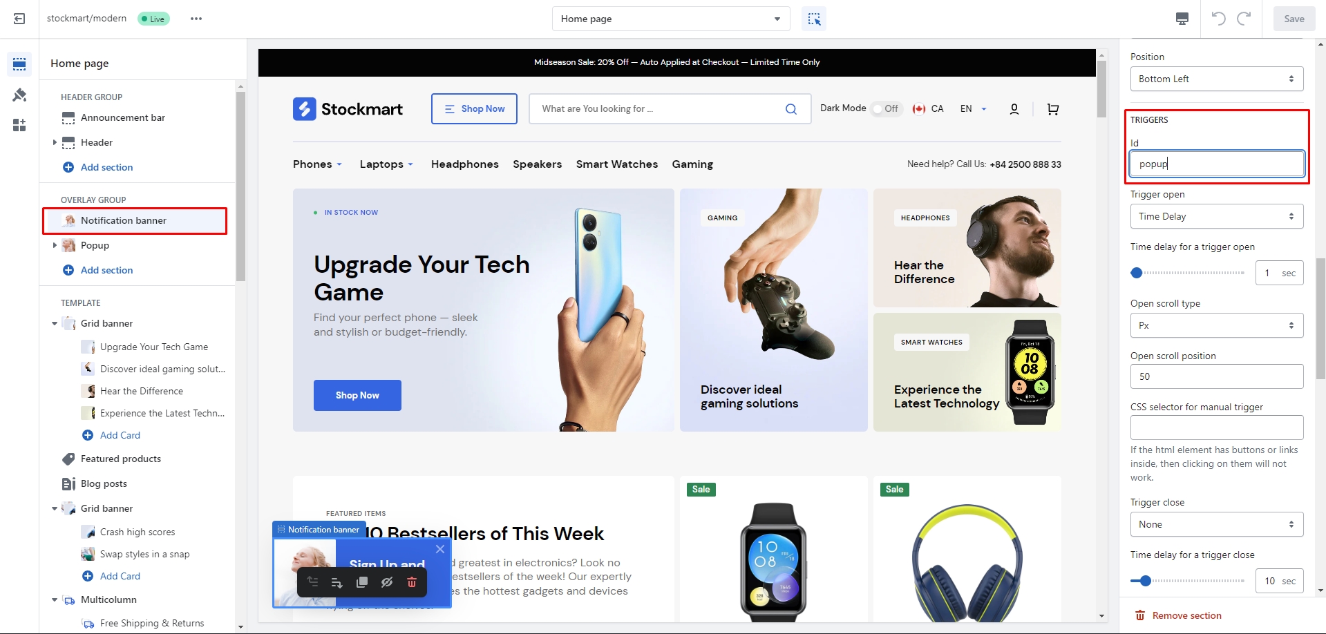
You can also use this banner as a button-trigger for opening another notification bar or a popup by
following these
steps:
Add the id of the popup/notification bar you chose to open to the Id field in the Triggers section
(e.g.
"popup")
Navigate to the popup/notification bar settigns and add the Id with "#" in the beginning to the "CSS
selector for manual
trigger" field.
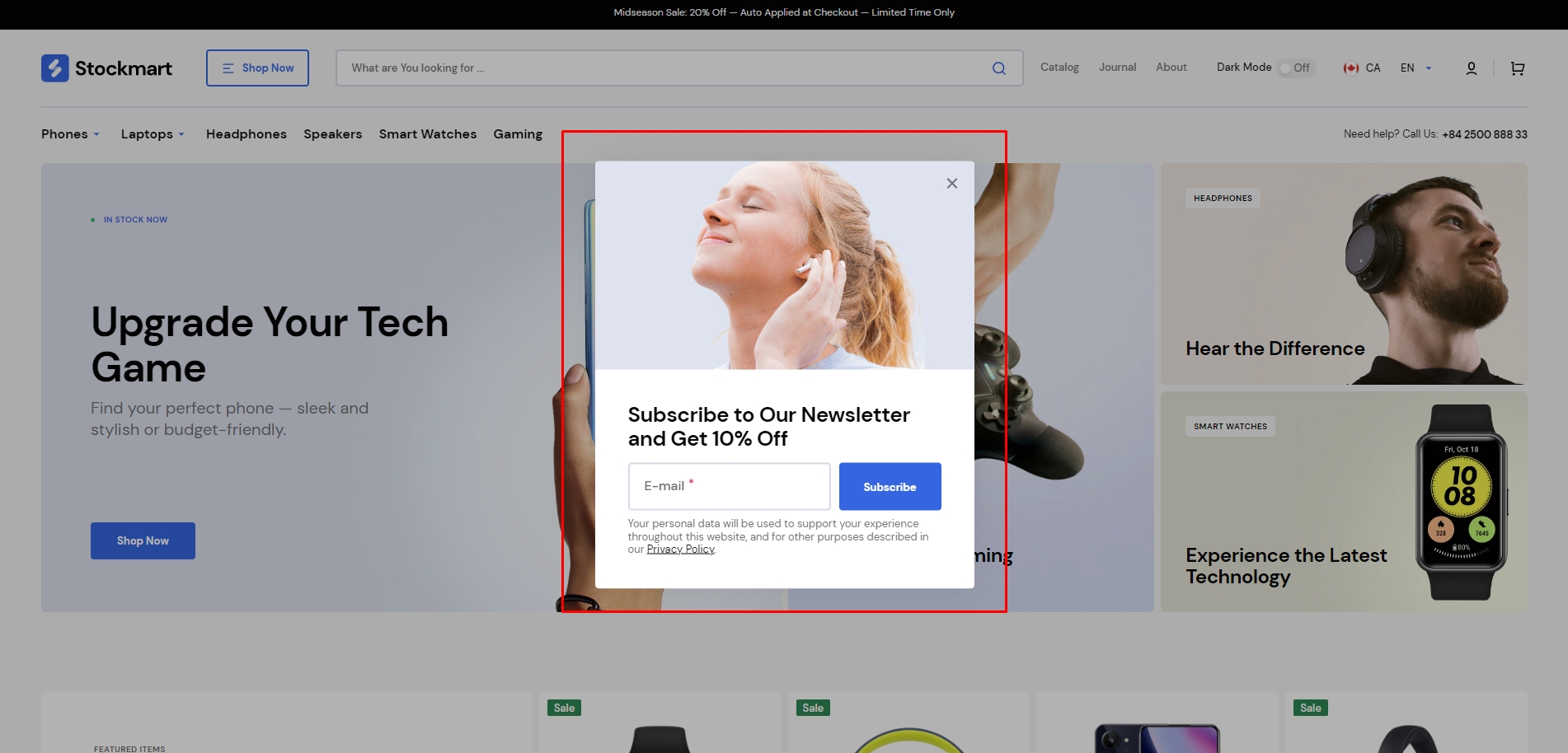
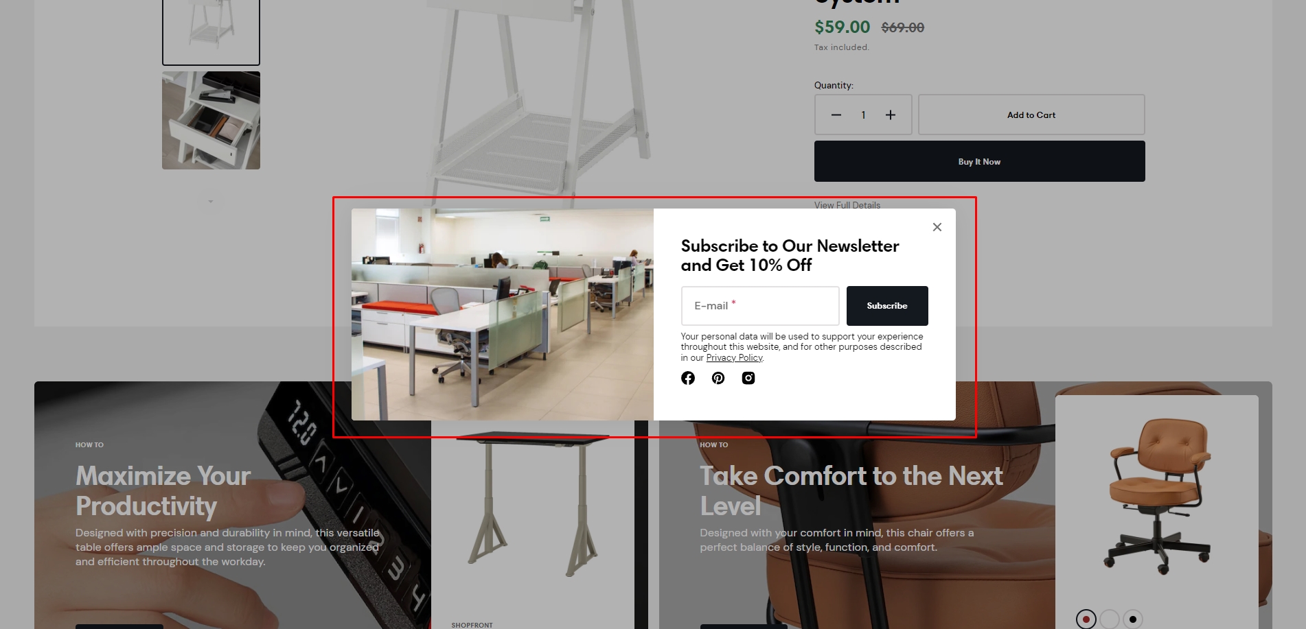
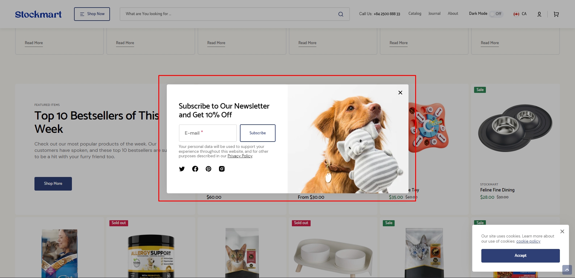
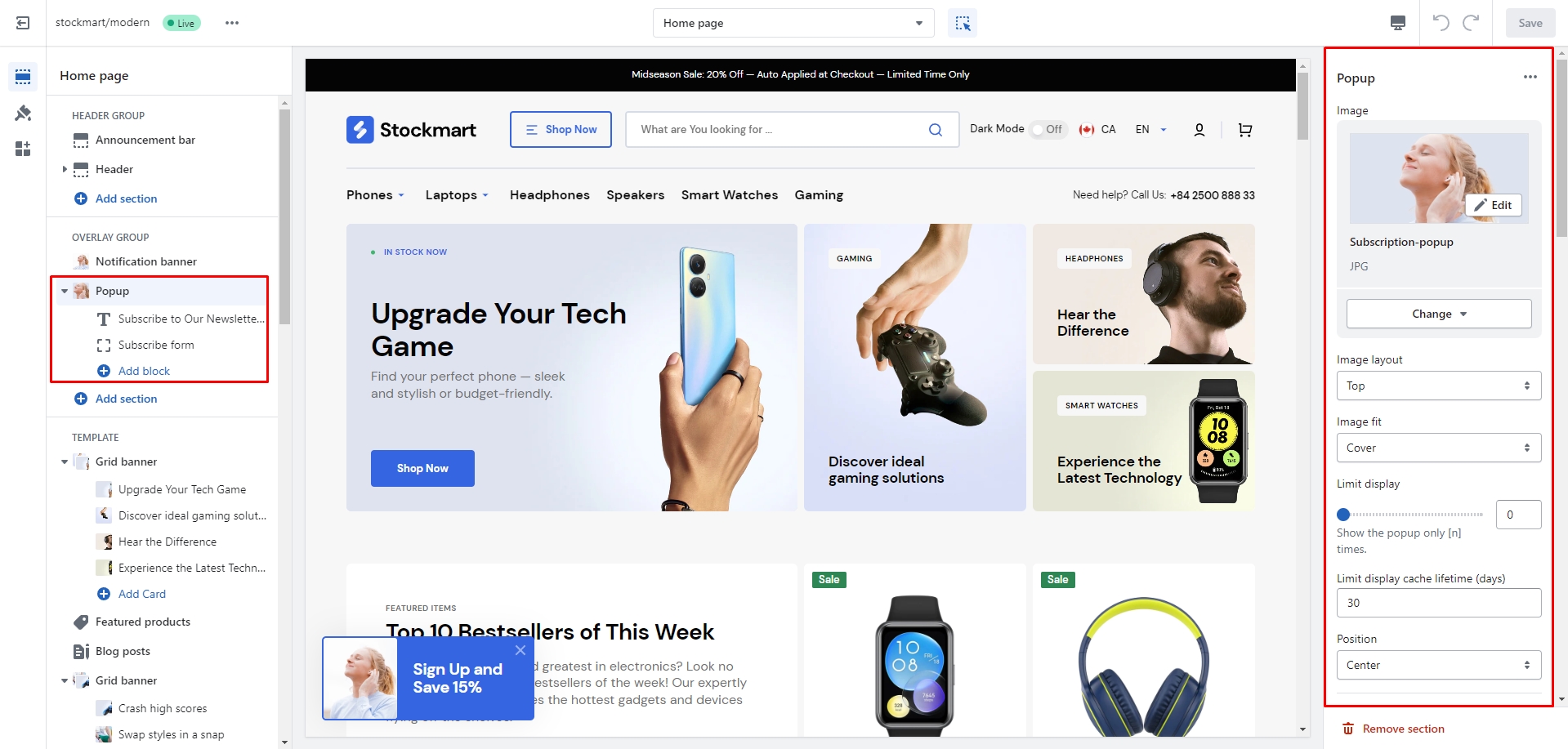
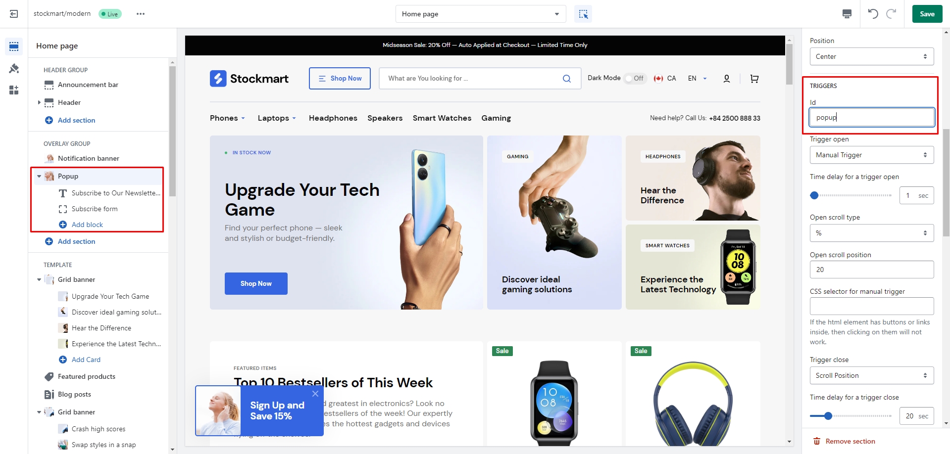
Popup
In the Popup settings, you can change layout, add image, subscribe form, edit position, change open and
exit animations
and options.
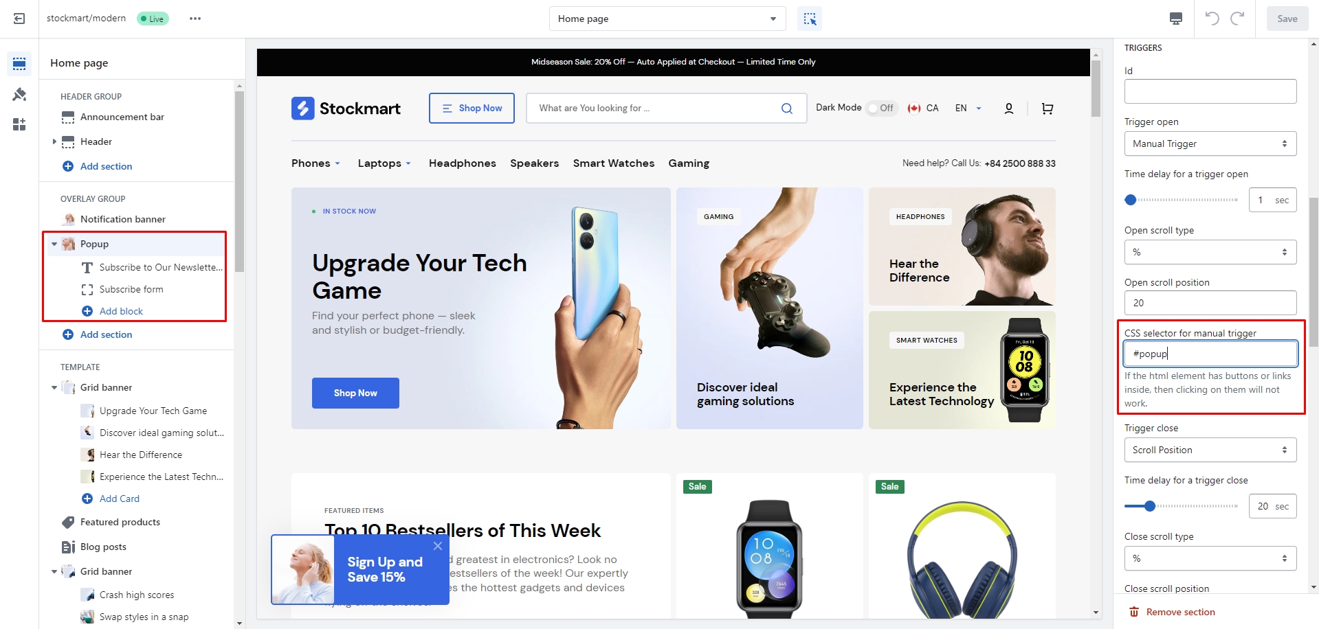
You can also use this popup as a button-trigger for opening another popup or notification bar by following
these steps:
Add the id of the popup/notification bar you chose to open to the Id field in the Triggers section
(e.g.
"popup").
Navigate to the popup/notification bar settings and Add the Id with "#" in the beginning to the "CSS
selector for manual
trigger" field.
Sections
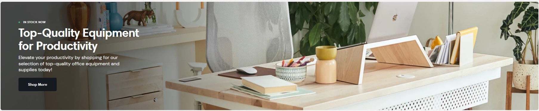
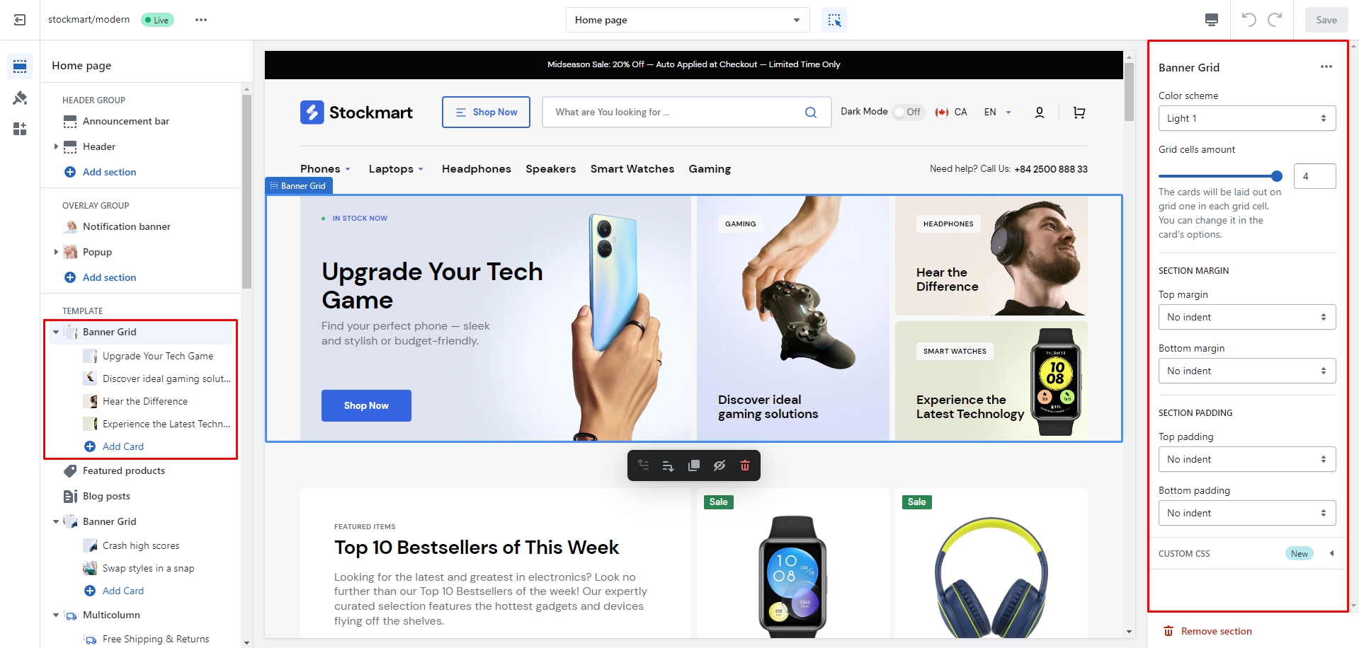
Banner Grid
In this section you can flexibly customize the section and blocks, their position, height, adjust the
background, text
size, padding, overlay effects — overlay or gradient, add a background image or an icon over the block.
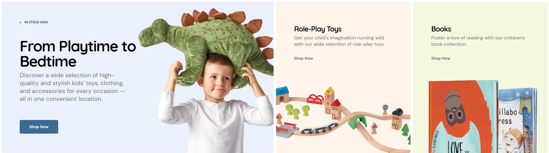
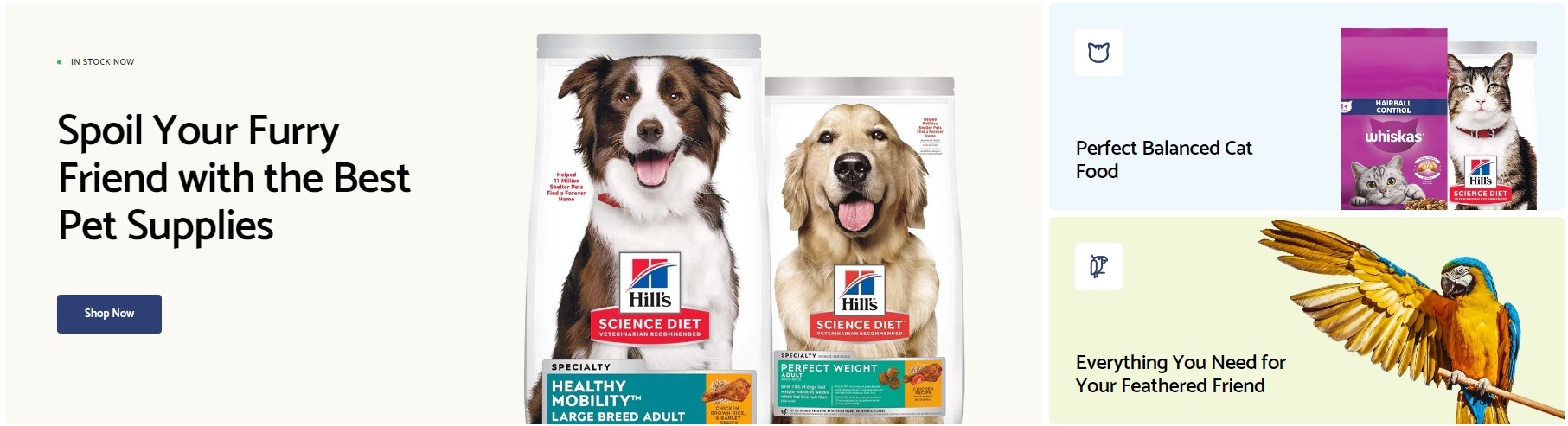
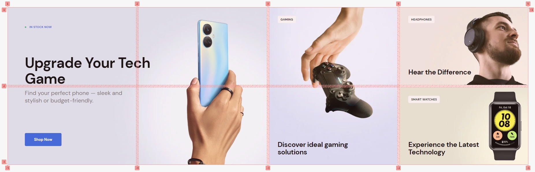
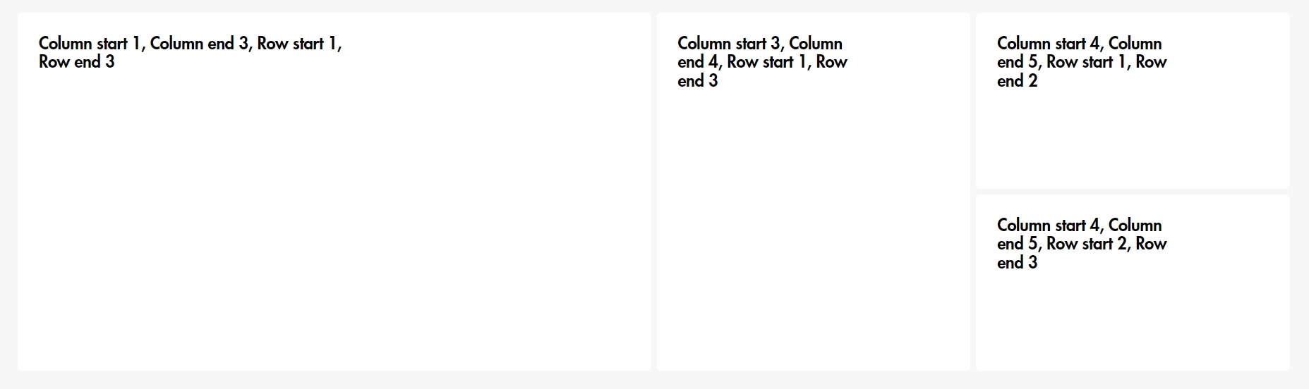
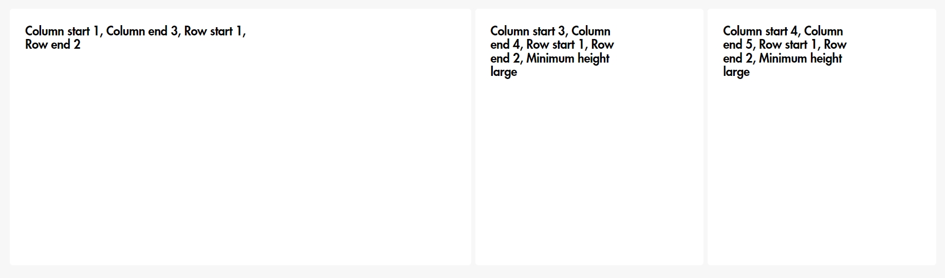
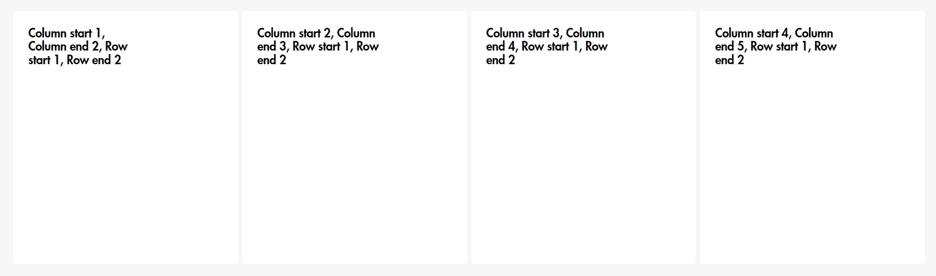
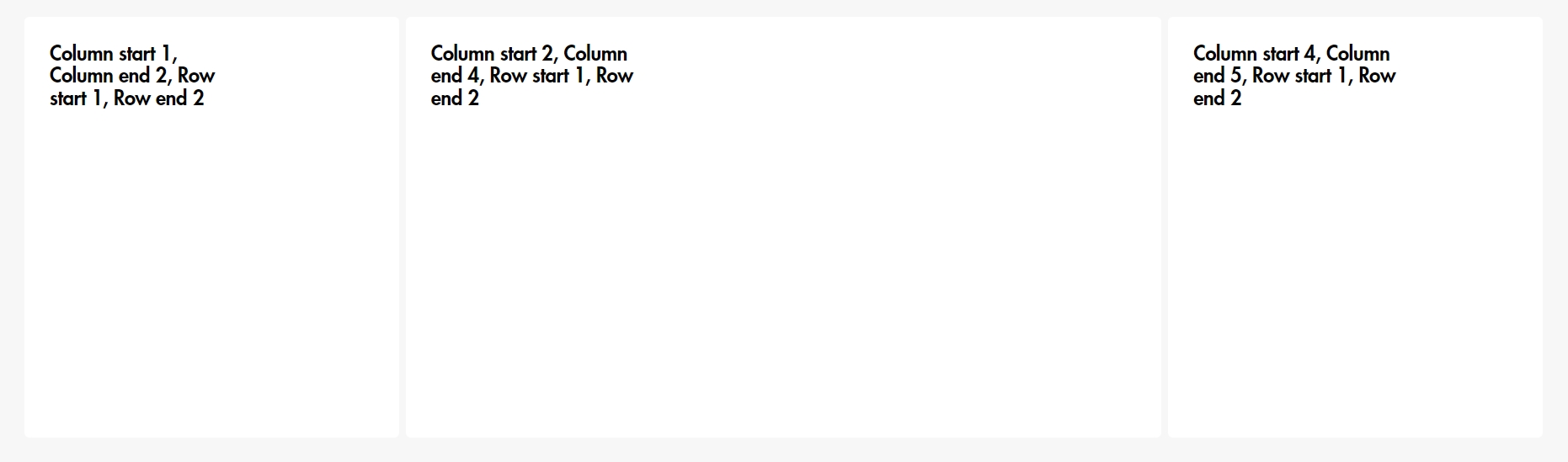
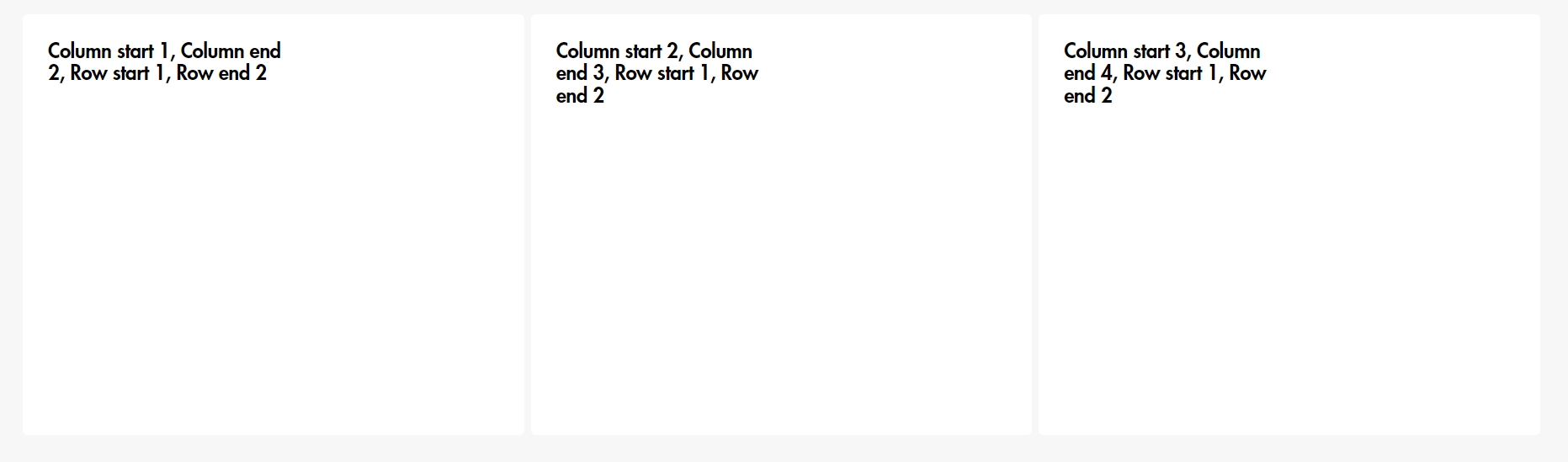
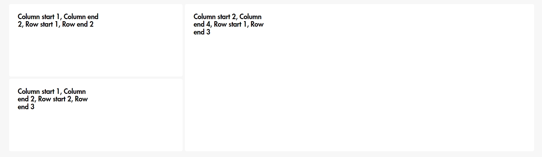
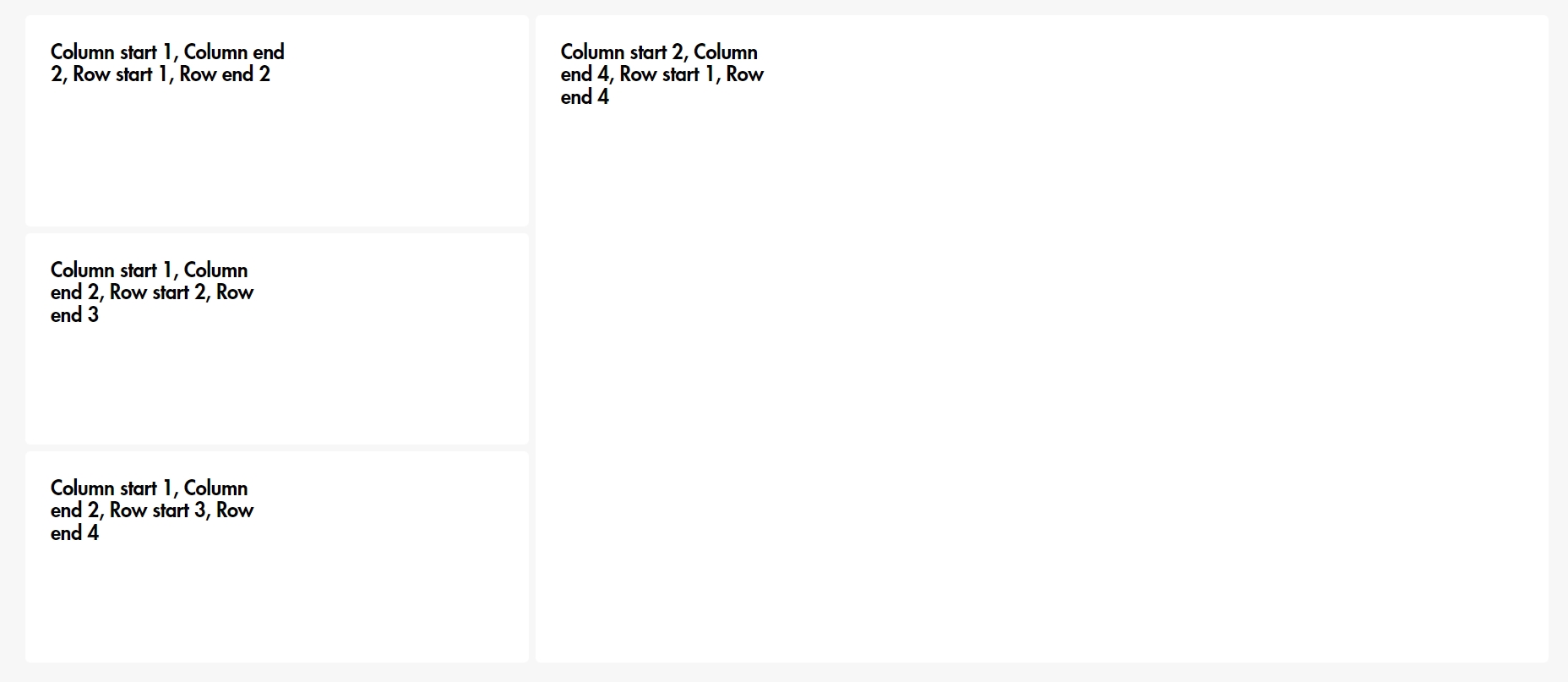
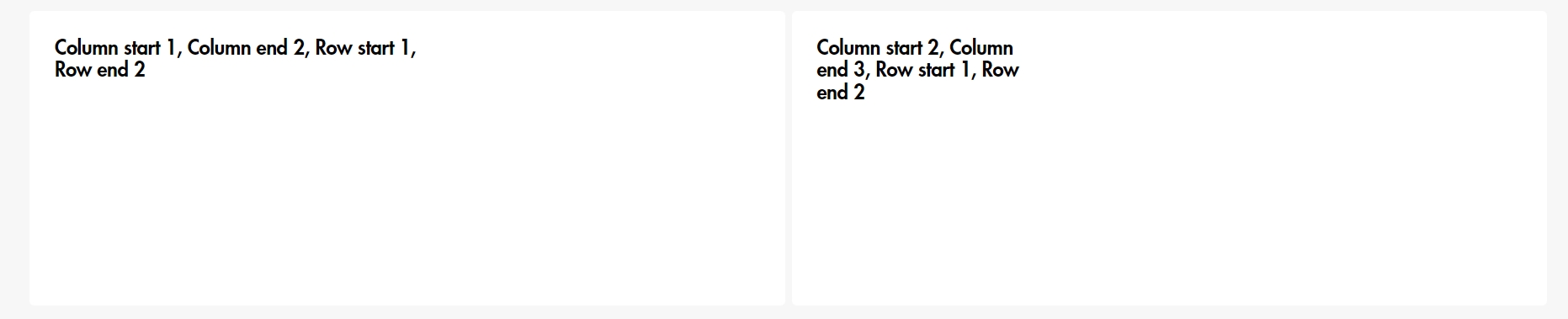
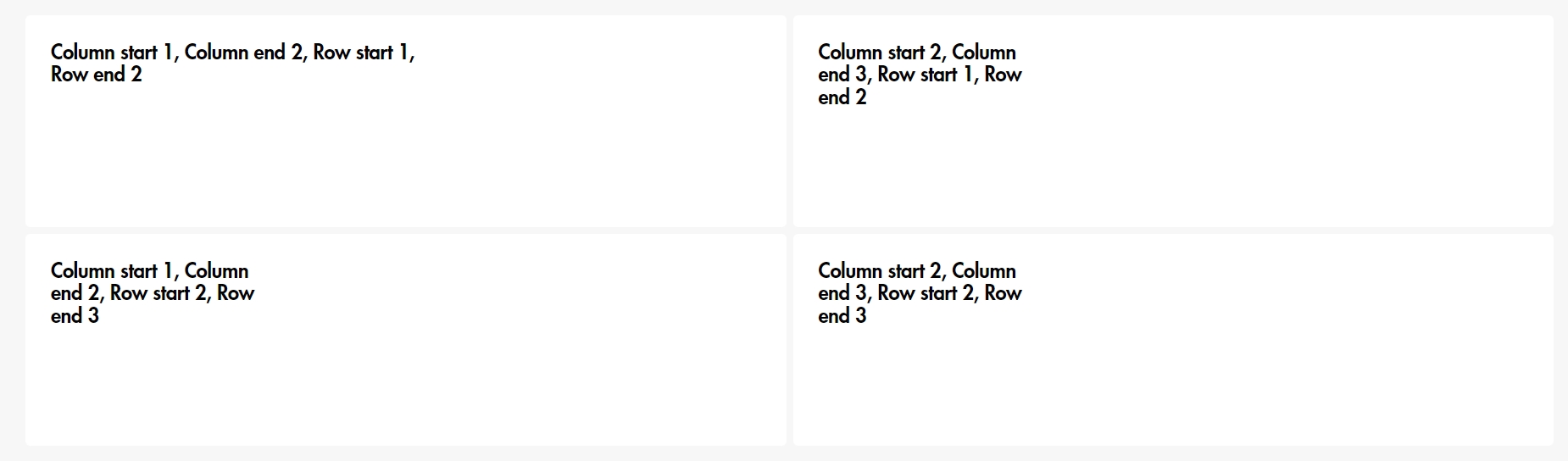
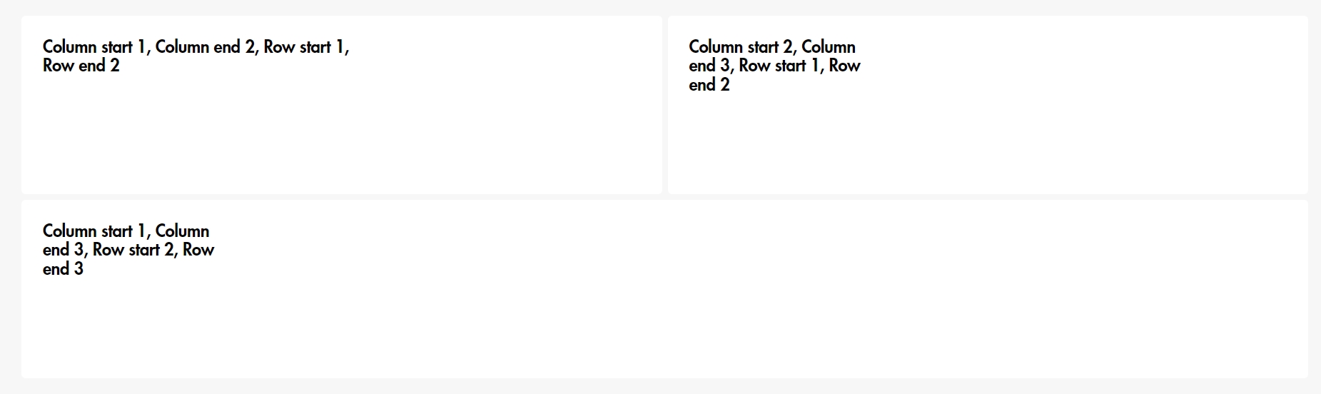
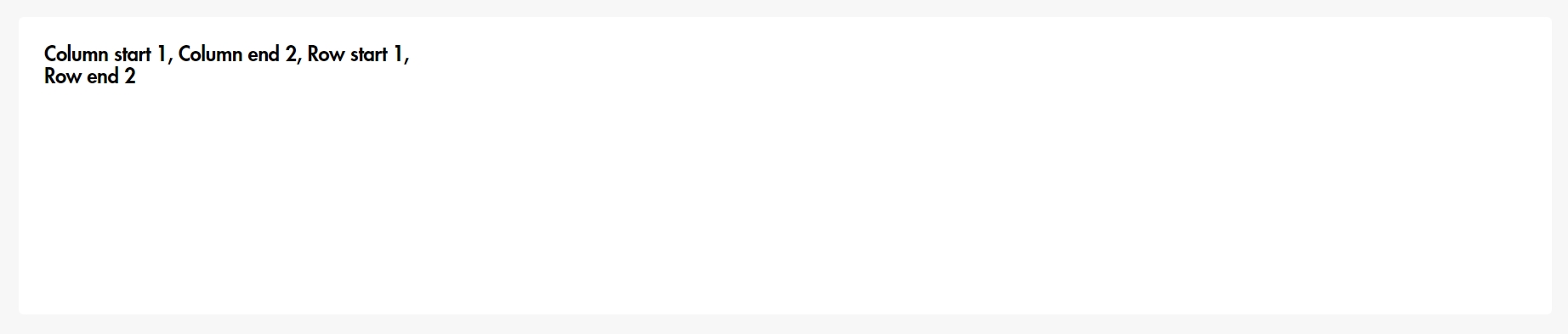
"Grid cells amount" means what kind of a grid will be in the section. If you want to make a block that takes
up 4
columns, then choose a value of 4 in "Grid cells amount", and for the block "Column start" 1 and "Column
end" 5,
because the beginning of the column and row counts from 1 instead of 0.
Examples of the grid and blocks
"Grid cells amount": 4
"Grid cells amount": 4
"Grid cells amount": 4
"Grid cells amount": 4
"Grid cells amount": 3
"Grid cells amount": 3
"Grid cells amount": 3
"Grid cells amount": 2
"Grid cells amount": 2
"Grid cells amount": 2
"Grid cells amount": 1
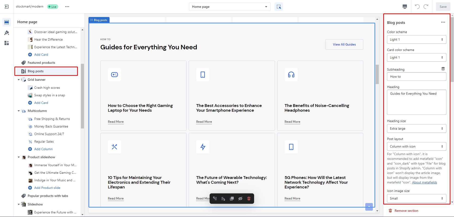
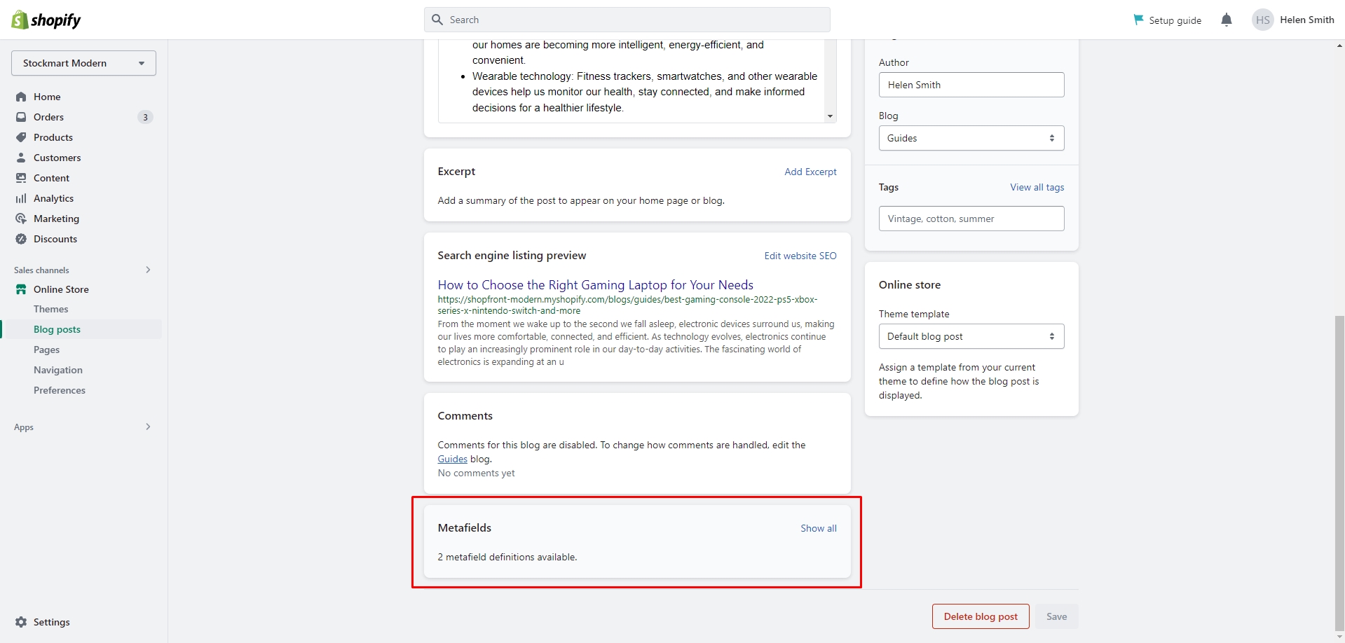
Blog posts
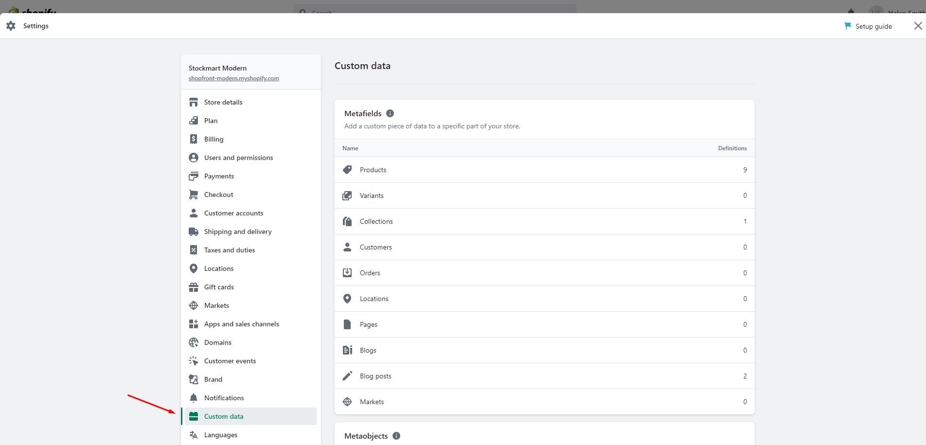
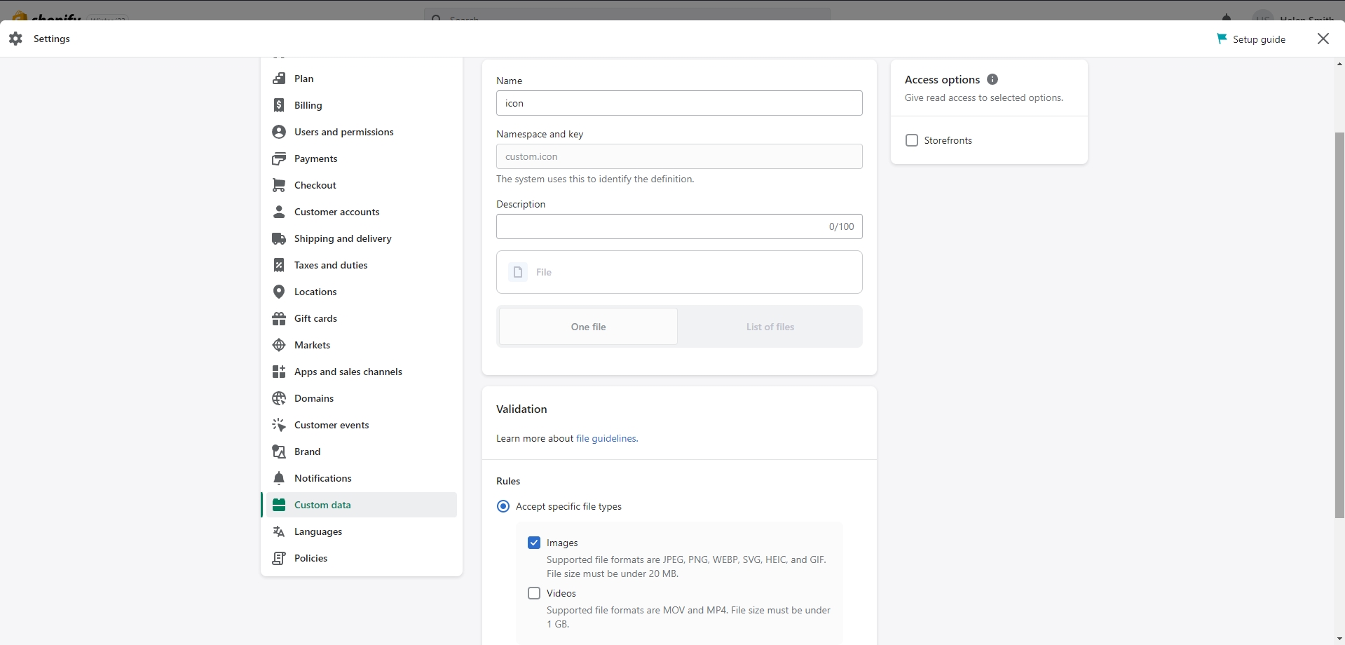
To add custom icons to your blog posts, follow these steps:
Go to the Admin panel and open Settings.
Navigate to Custom Data and select Blog Posts.
Add a new definition with the name "icon".
Select the "File" type and check the "Images" box.
Save the changes.
The custom icon metafield will now be visible in the blog post settings. You can upload your images here
and then adjust
the post layout in the Blog Posts section settings.
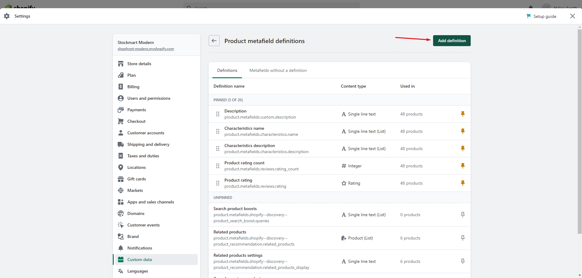
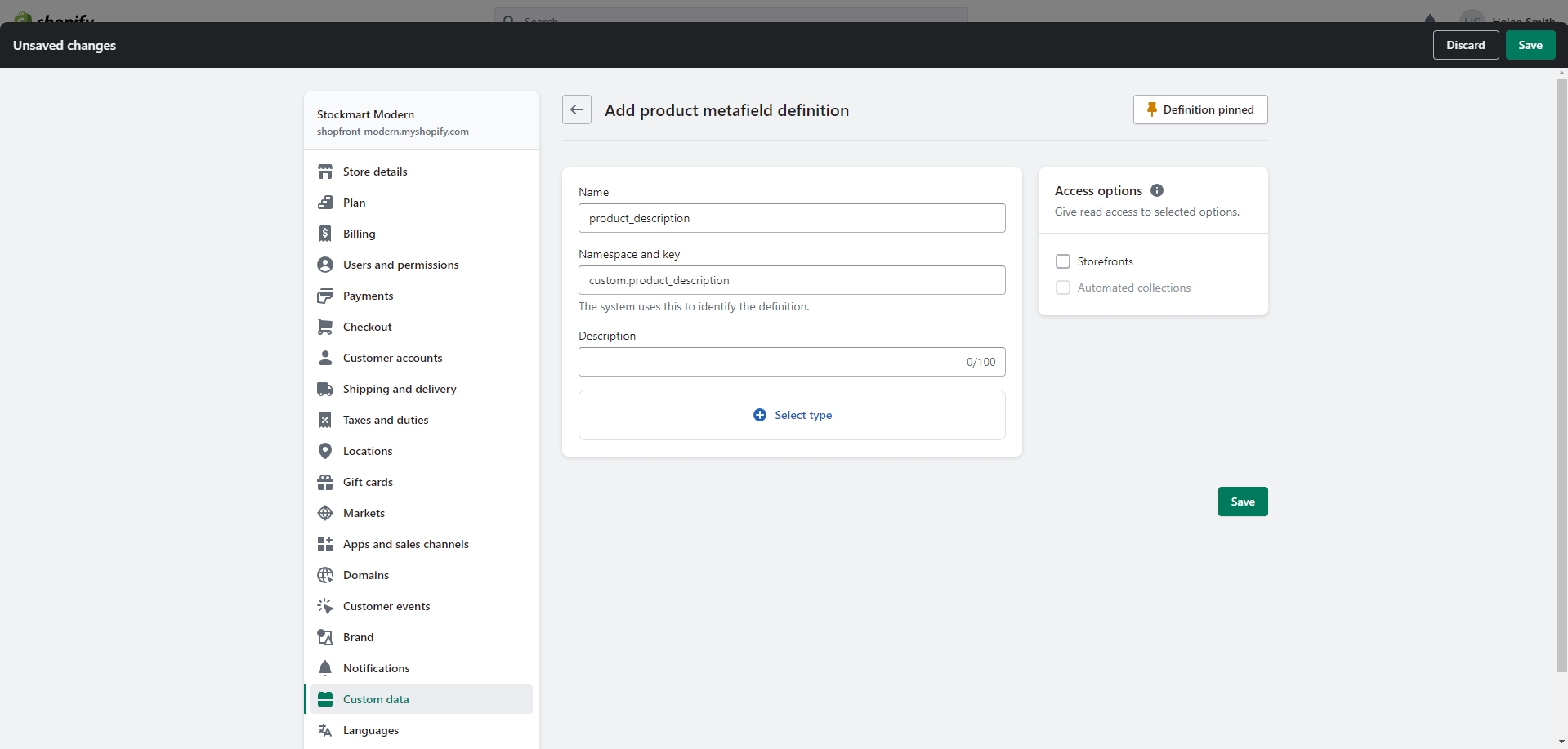
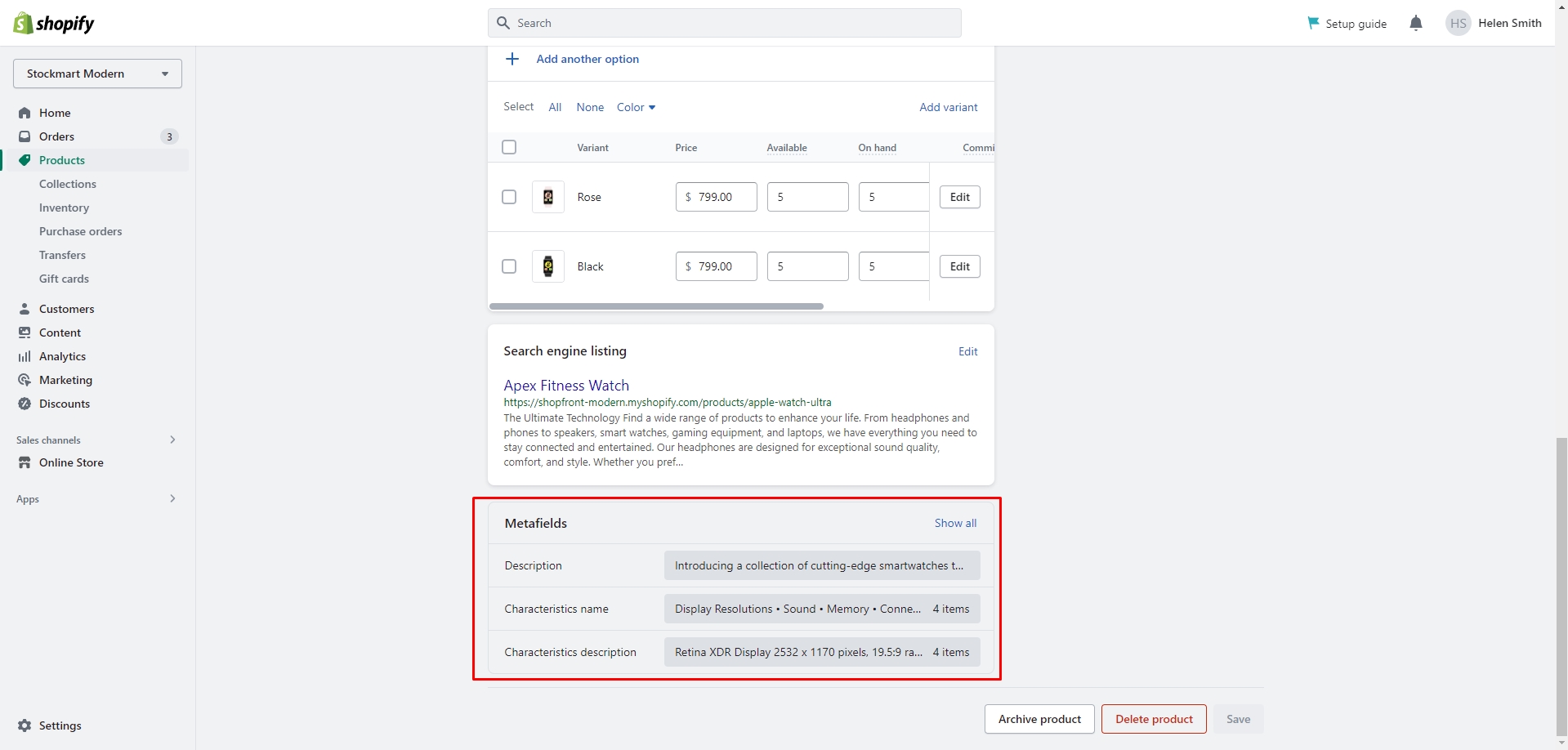
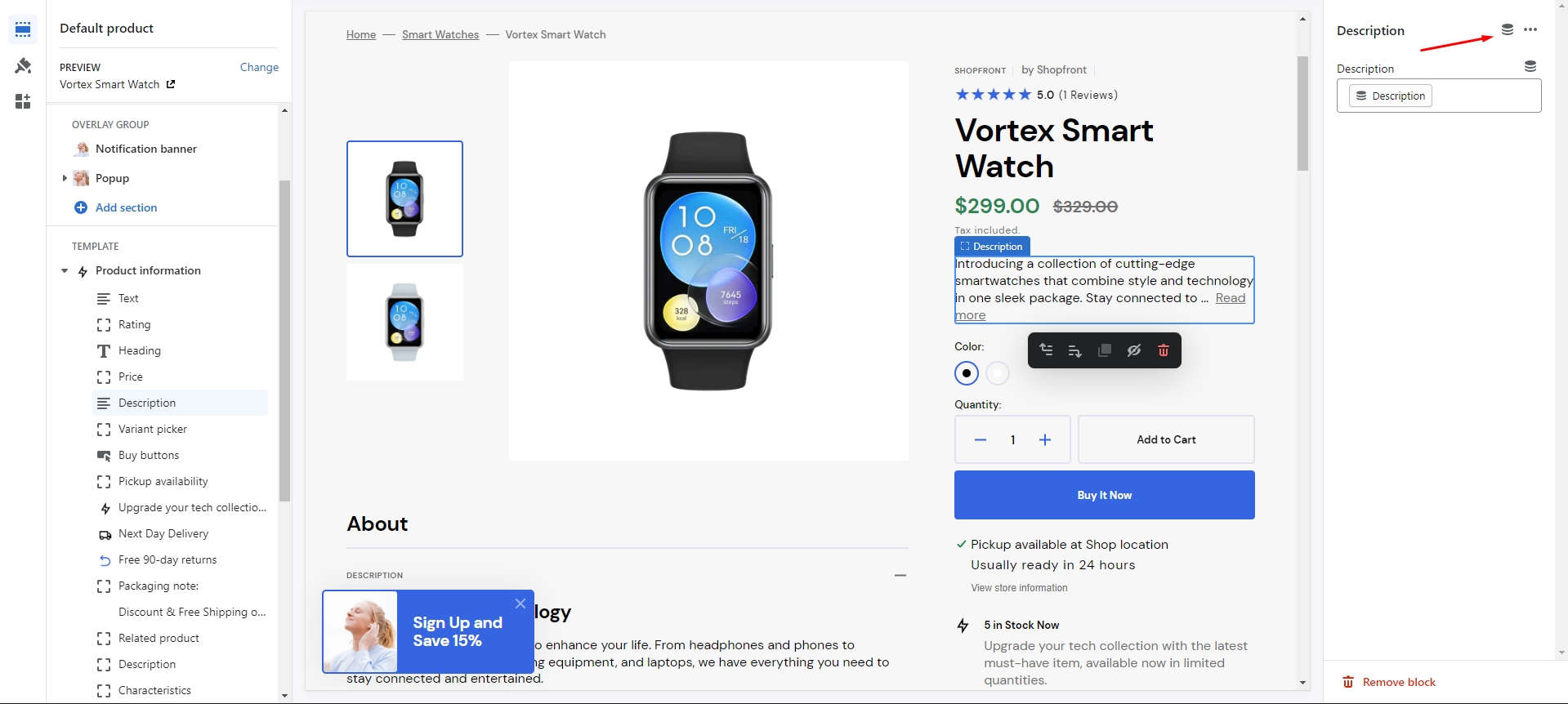
If you would like to add more dynamic information to the product, you can use metafields. To add
metafields, navigate to
Settings > Custom data > Products in the Admin panel.
Here are the examples of using metafields:
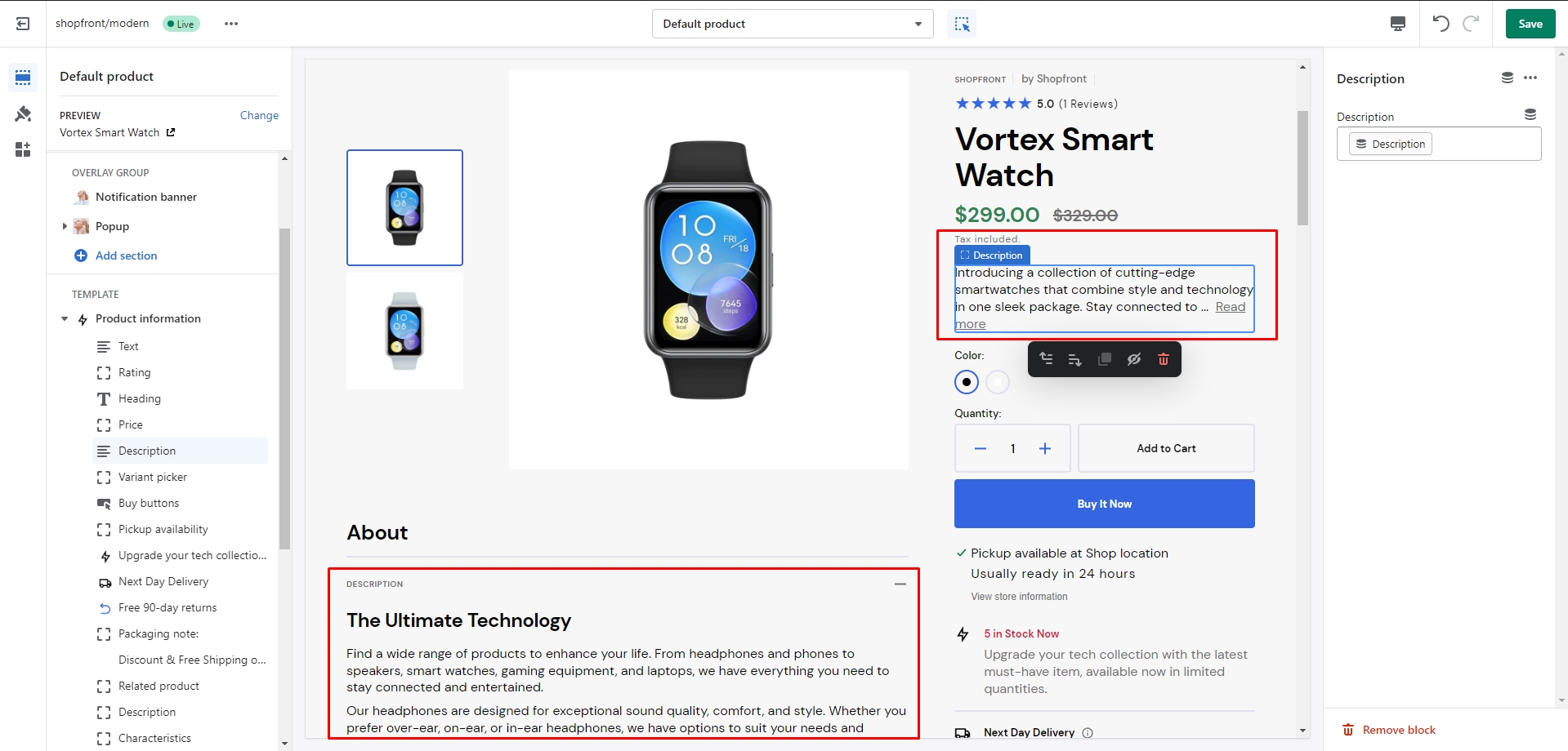
There are 2 types of the product description on the page — long and short.
The long one you can add as
usual, and for
the short one you can use a metafield definition named "description" with the "Single-line text" type. You
can add and
edit this metafield in the product page.
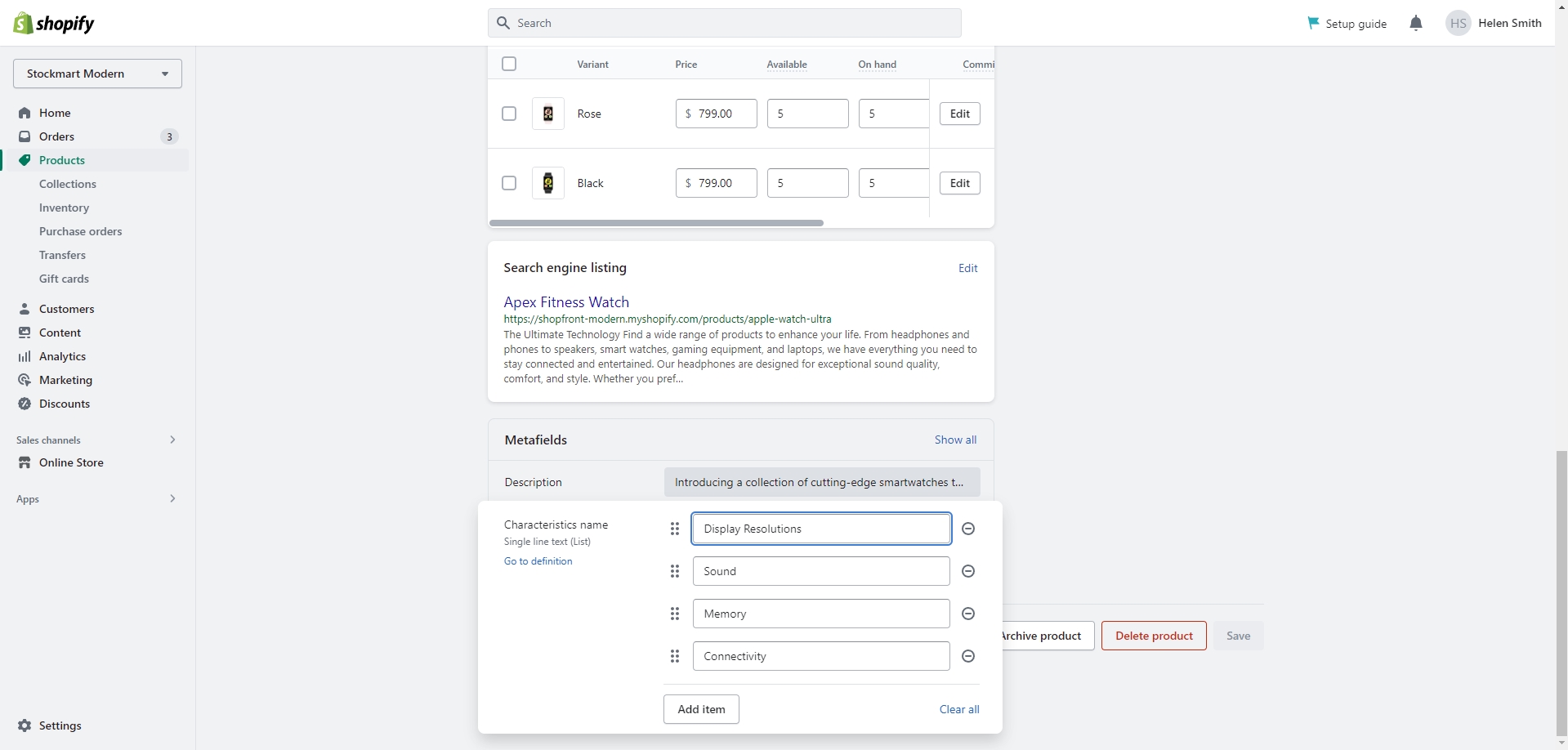
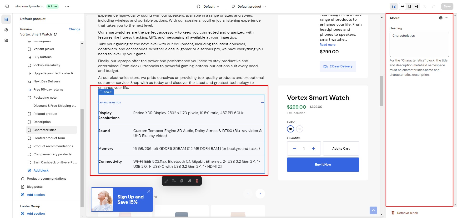
You can add dynamic characteristics to the product by following these steps:
Add two metafield definitions with the exact namespaces and keys "characteristics.name" and
"characteristics.description".
Choose the "Single-line text with list of values" type for the both metafields.
Navigate to the product and add characteristics.
Add a block "About" with a heading "Characteristics" to the product page.
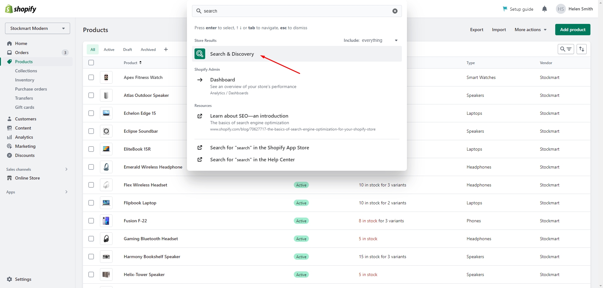
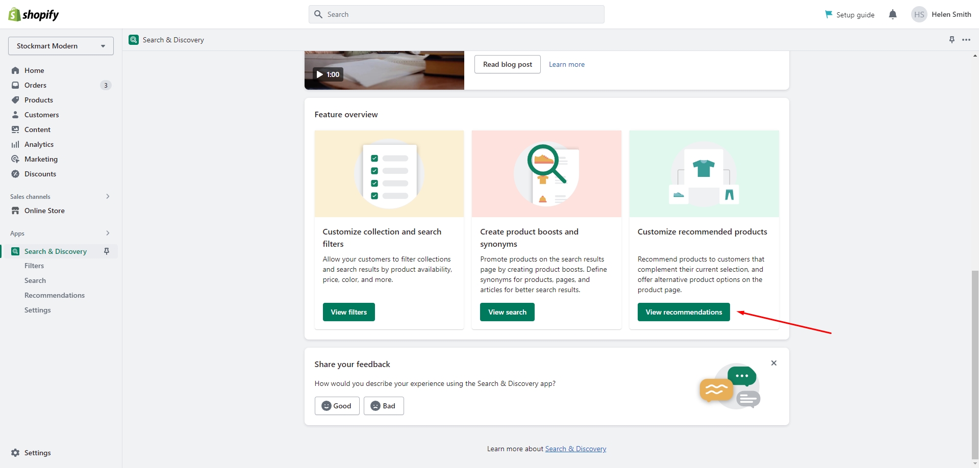
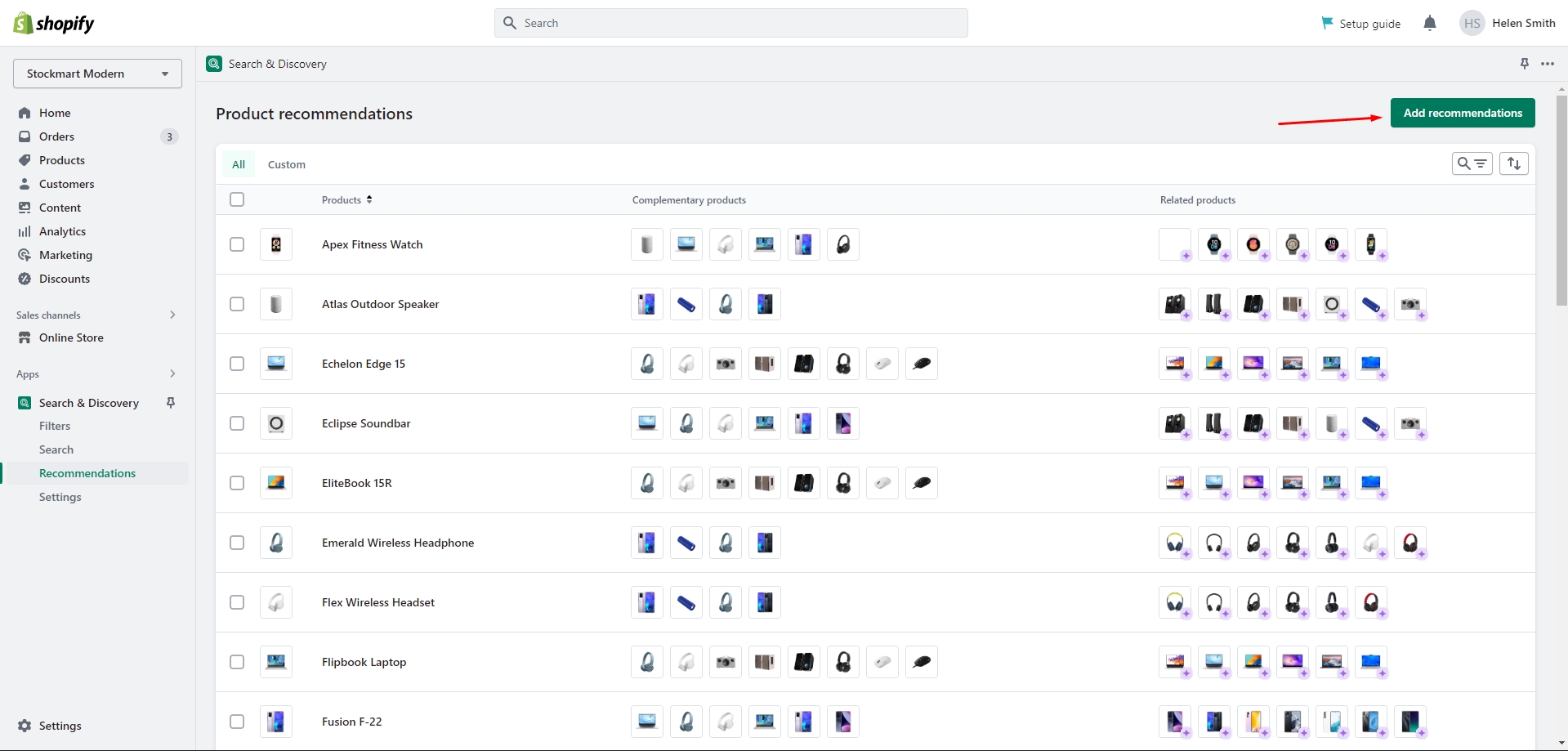
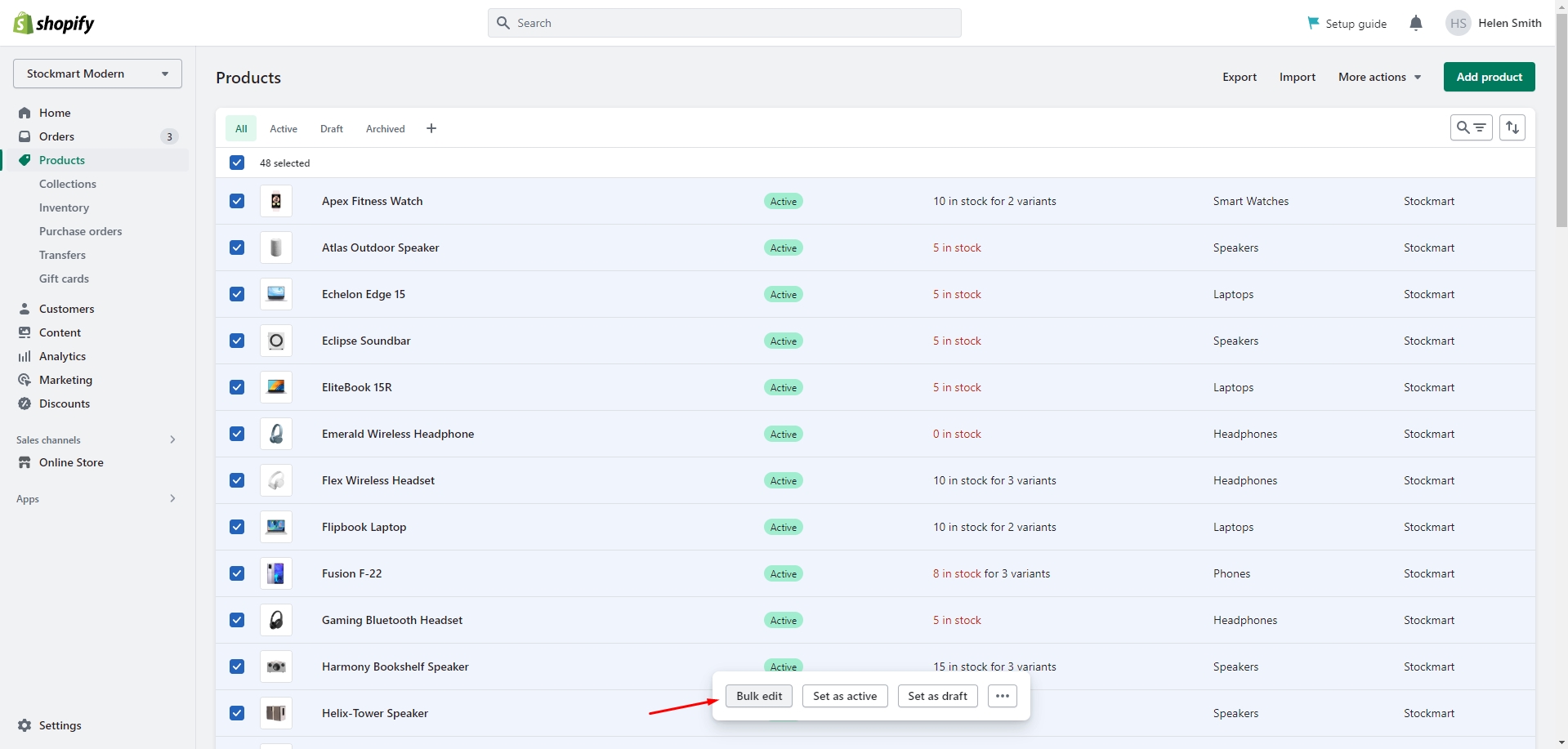
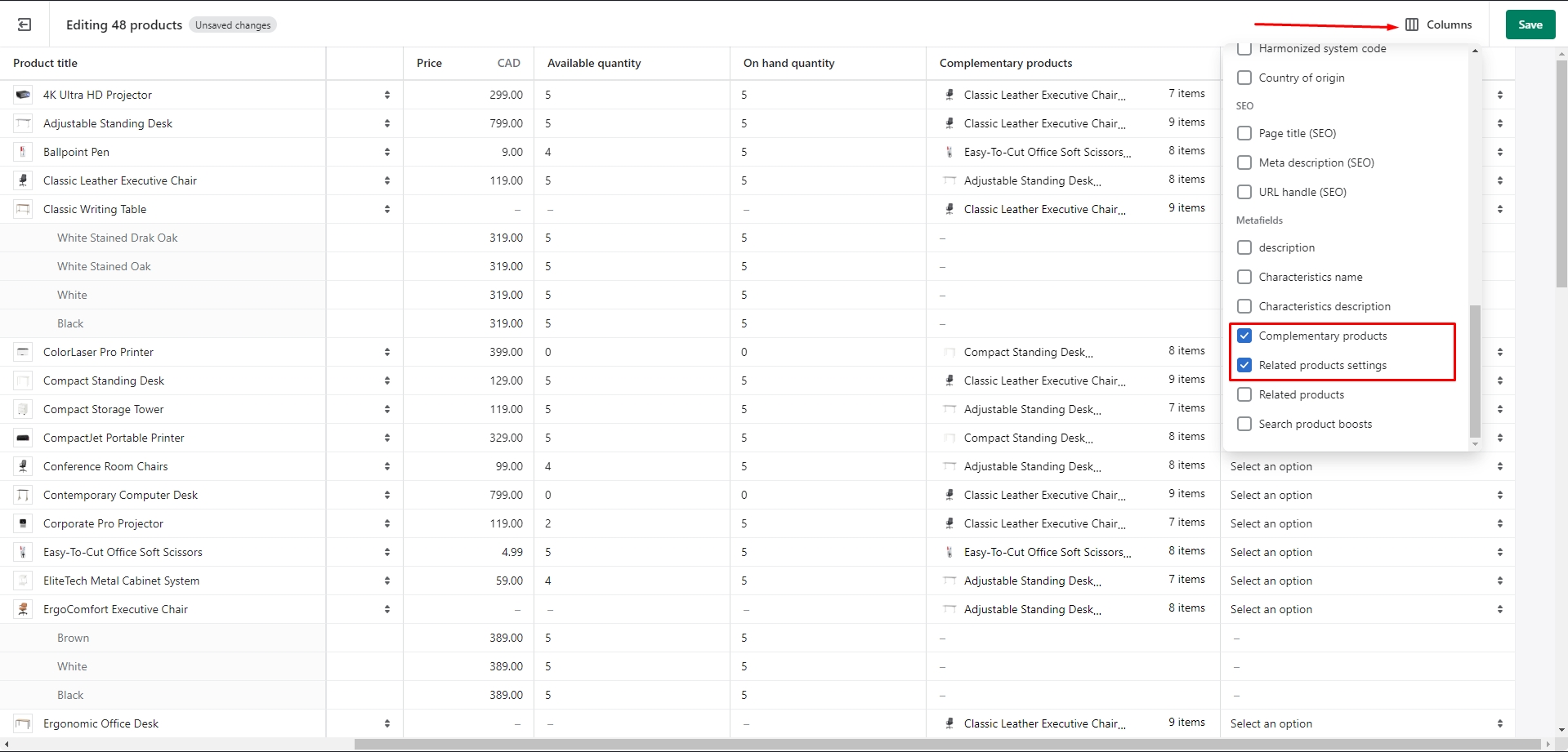
Product recommendations and Complementary products
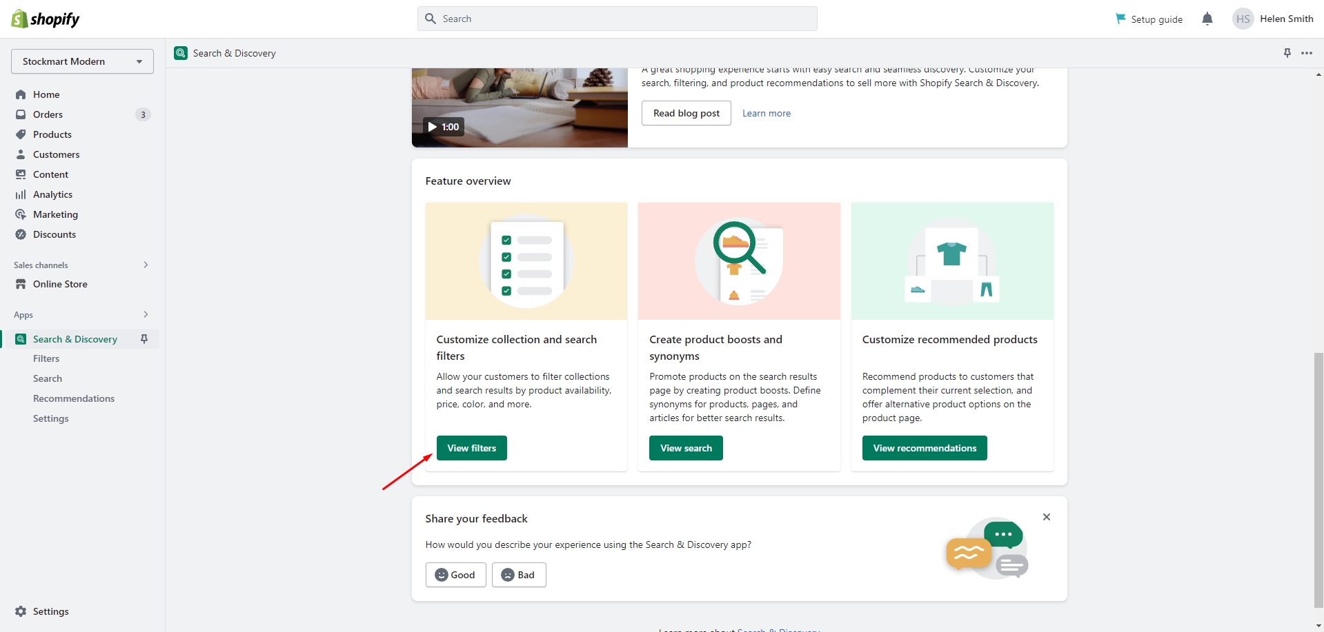
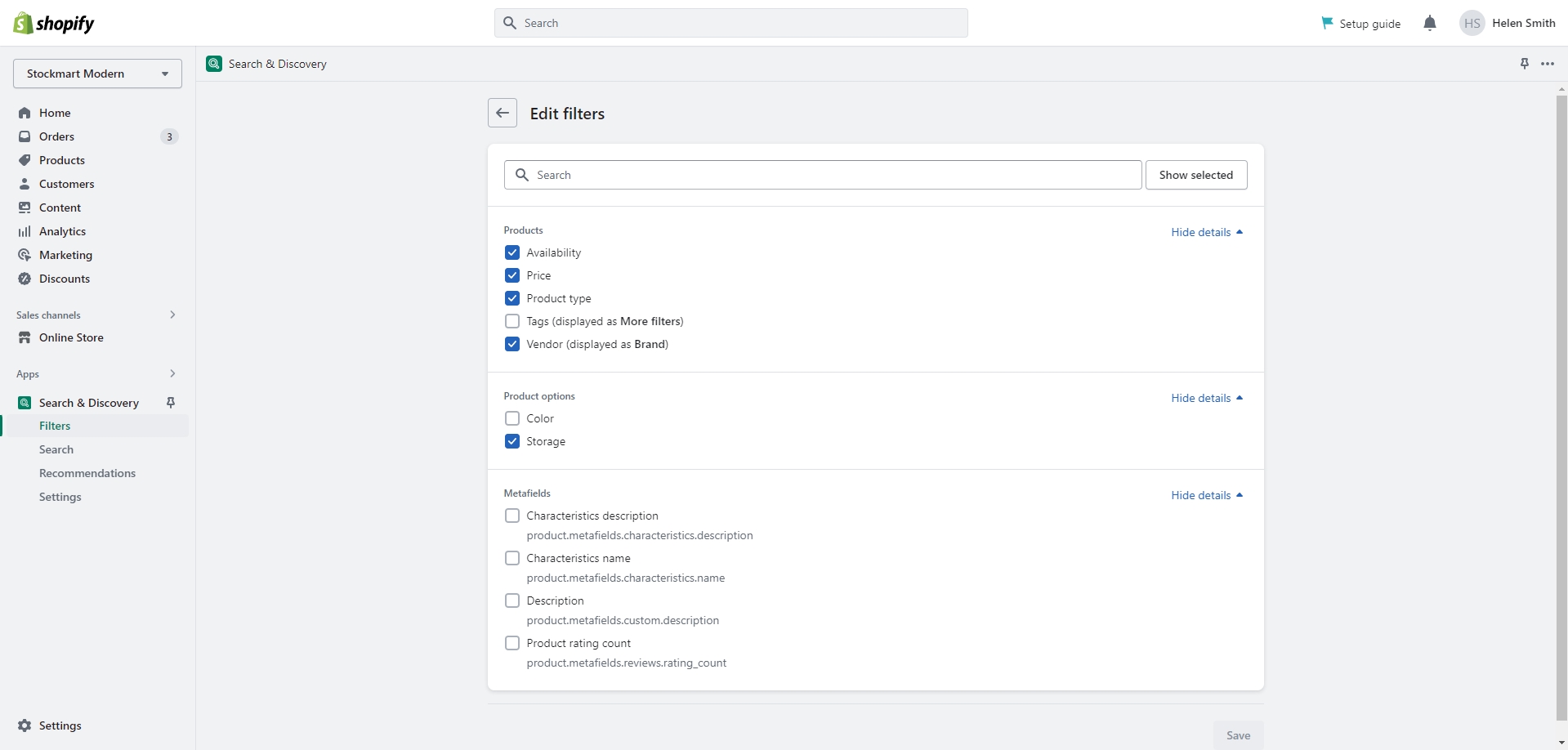
To add and edit product recommendations, follow these steps:
Install the Search & Discovery app by Shopify from the Apps page in the Admin panel.
Once installed, open the app and follow the 'View recommendations' link in the Feature overview section to
add
recommendations to your products.
You can easily edit or add recommendations for multiple products using the Bulk Editor in the Products tab
in the Admin
panel.
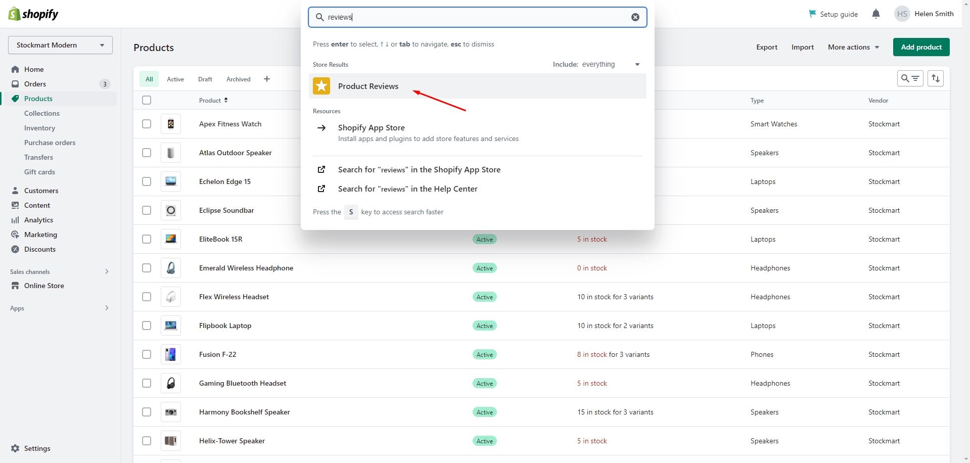
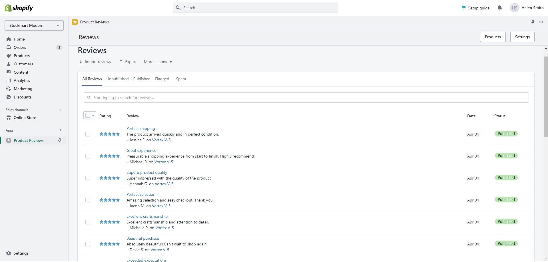
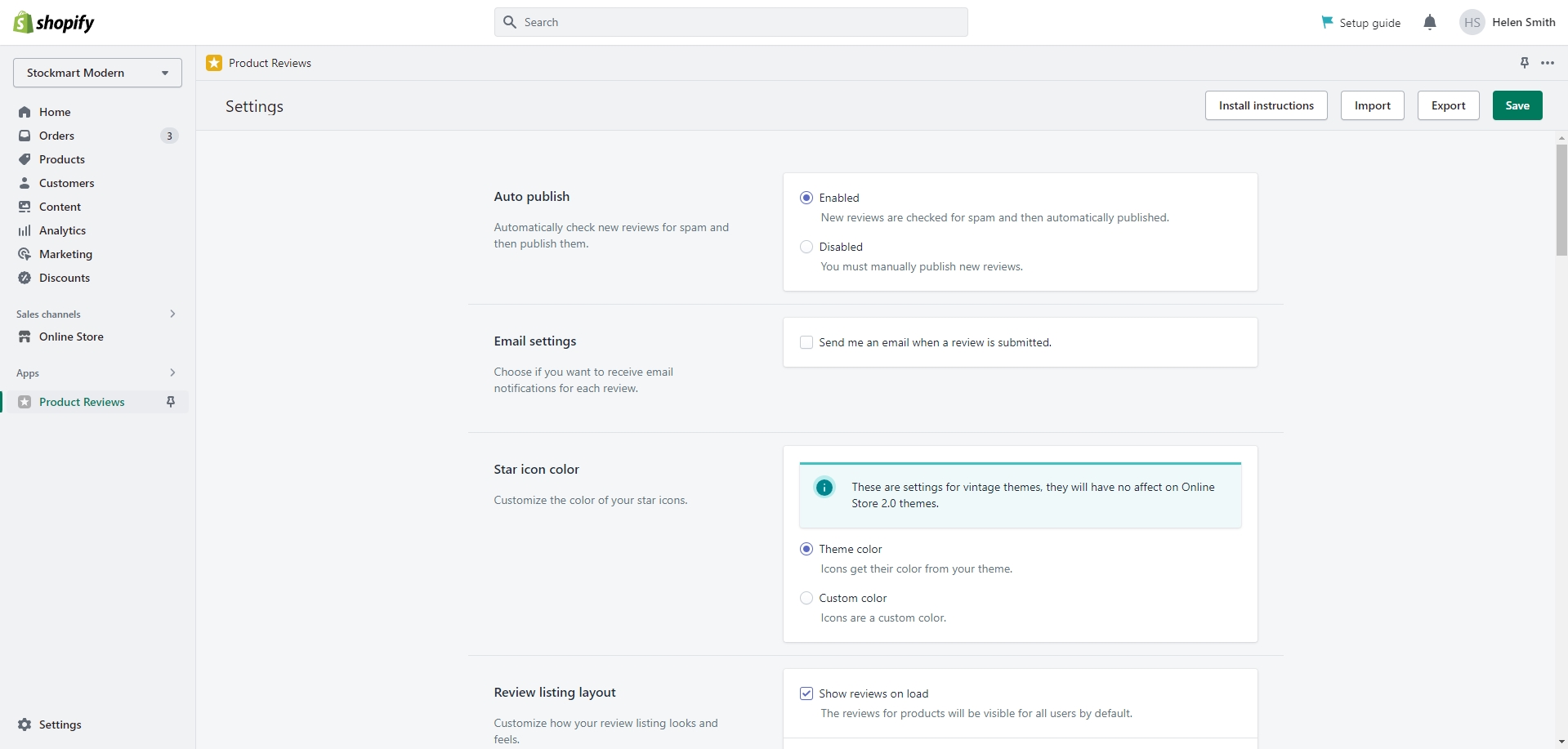
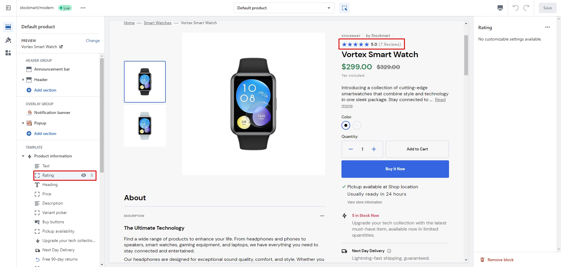
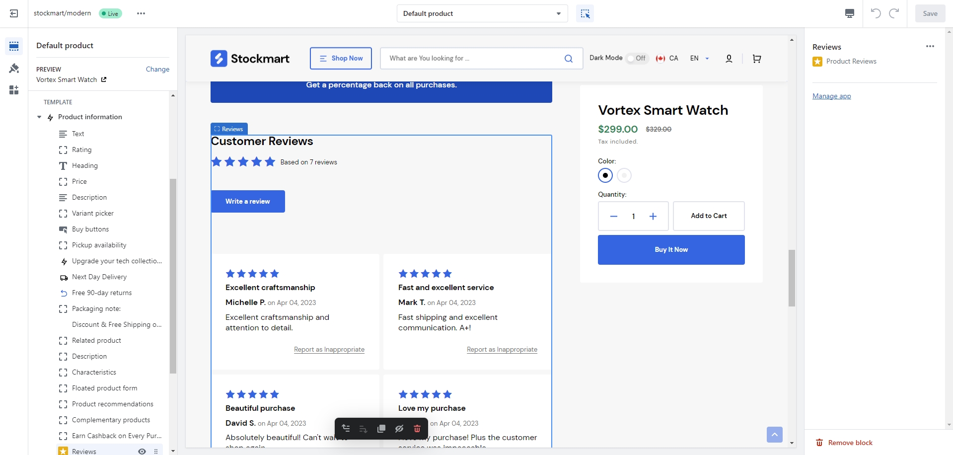
Product reviews
To enable and manage customer reviews on your shop, follow these steps:
Install the Product Reviews app by Shopify from the Apps page in the Admin panel.
After installing the app, add Rating and Reviews blocks to your Product page.
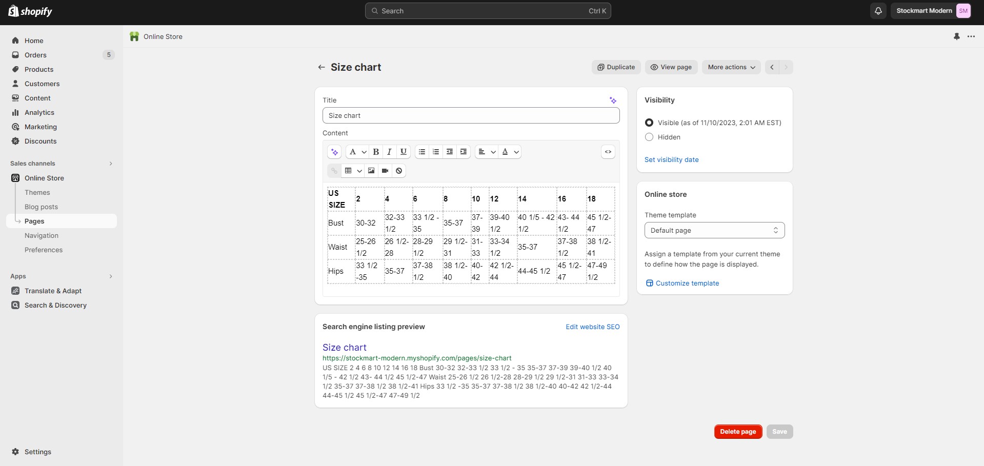
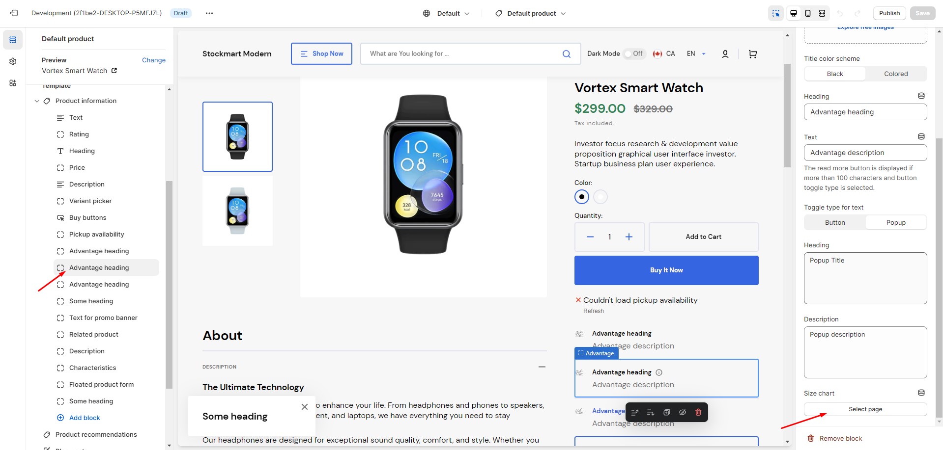
Size chart
To add a size chart, follow these steps:
Create new page with a table.
Add a "Advantage" block to the product page.
Select "Size chart" page. Works only in Popup toggle type.
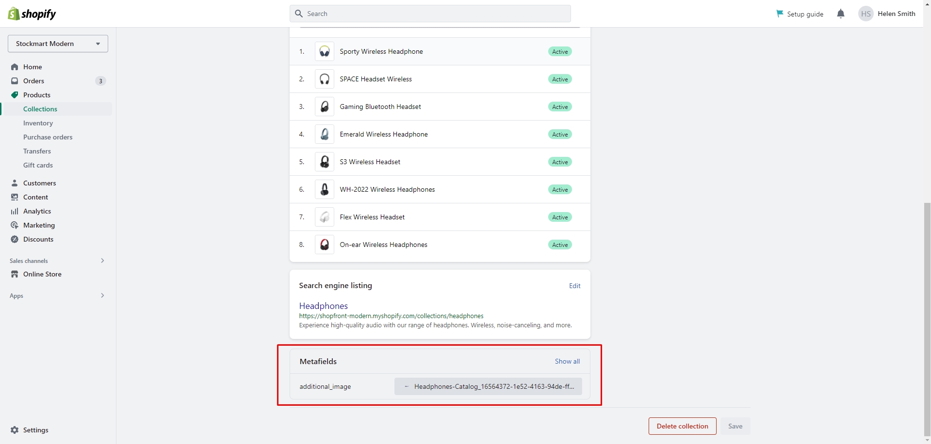
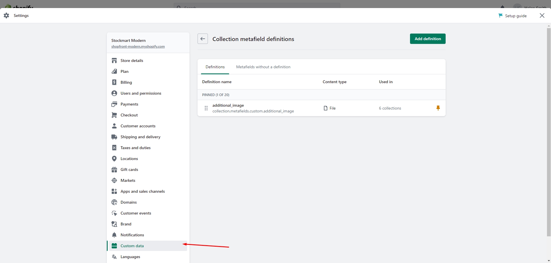
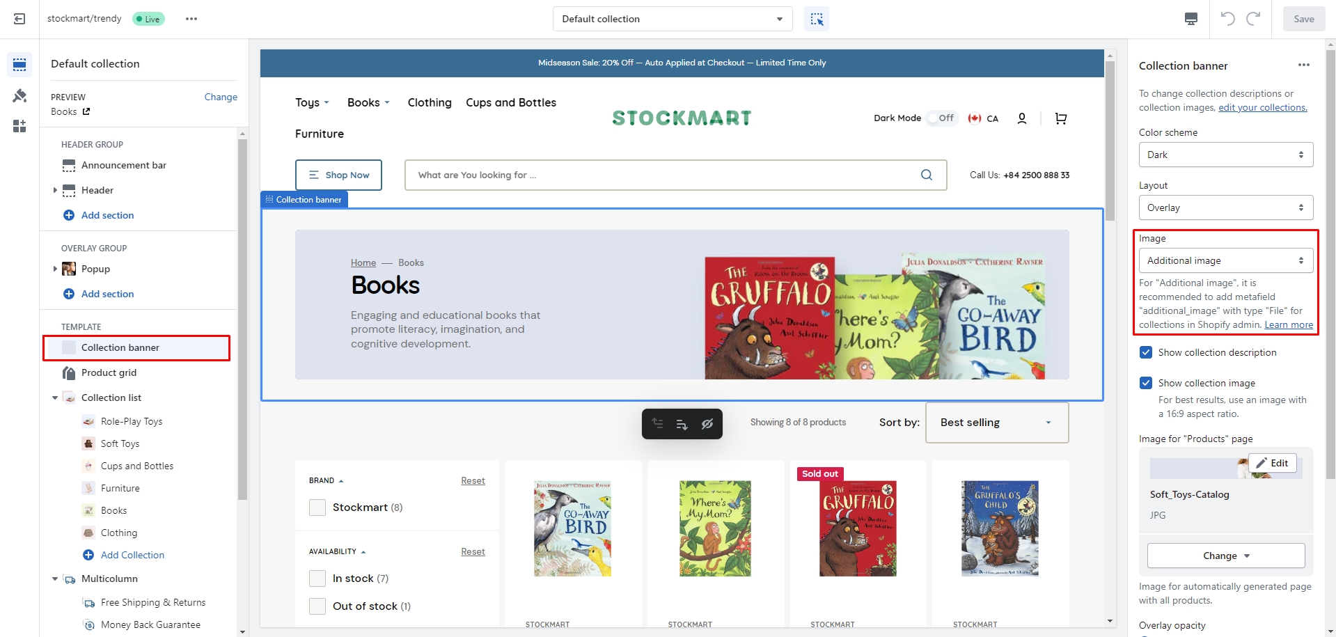
Collection page
You can add custom images to your collections by following these steps:
Open Settings on the Admin panel.
Navigate to Custom Data and select Collections.
Add a new definition with the name "additional_image".
Select the "File" type and check the "Images" checkbox.
Save the changes.
The custom icon metafield will now appear in the Collection settings, where you can add your images.
Afterwards, you’ll
be able to change the Image type in the Collection banner section settings.
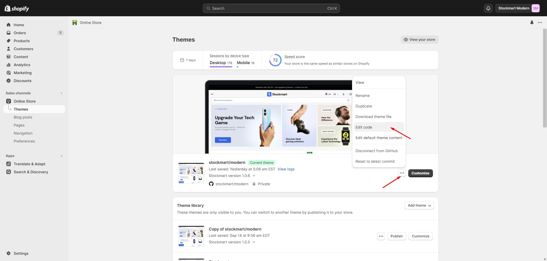
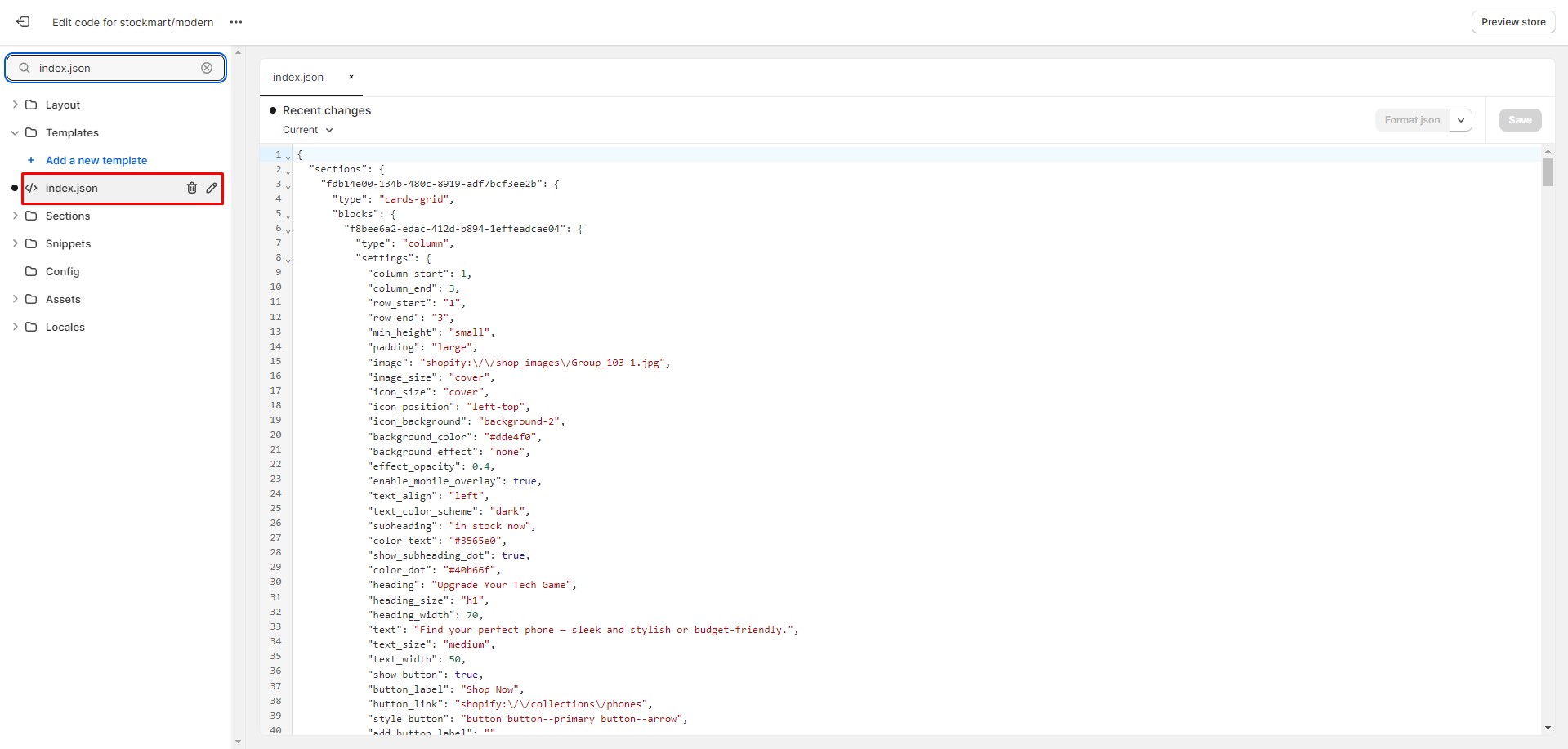
Follow to the section Online Store > Themes in your store. Click the three dots button of your
theme.
Open the code editor by clicking the Edit code button.
In the code editor, search for the file "index.json" and paste the demo structure. Click
"Save" to save your changes. If there's an error, click "Format json" and try to save the file
again.